Working the Trees
I have been slowly developing an image enhancement workflow I call, The 10-channel Workflow. This is a flexible image enhancement strategy extracted from the ground breaking work of Dan Margulis. Dan’s working method, originally called the Picture Postcard Workflow, was designed to quickly generate the kind of enhancements that would be appropriate for attractive travel pictures, landscapes, and other scenes where bright color and image detail were desirable. As it turns out most of the highly evolved techniques that Dan developed have application for a wide range of image types. My goal has been to simplify the sometimes complicated techniques into a raw-through-final Photoshop workflow for the photographer working with their own images. The most important aspect of this workflow is a basic understanding of the channel structure of the main color workspaces in Photoshop: RGB, Lab, and CMYK. Understanding the idiosyncrasies of the individual grayscale channels, and how they relate to the whole color image, allows for some very powerful techniques for re-shaping the tone and color of an image.
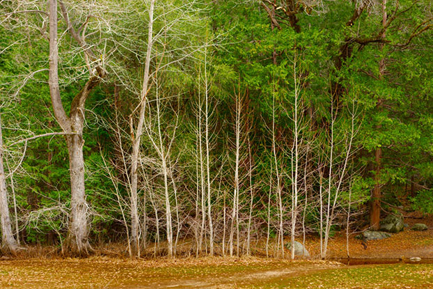
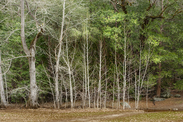
As one example of the kind of things that are possible, I will work through one possible interpretation of this image – shown here in an almost unaltered-from-the-camera state:
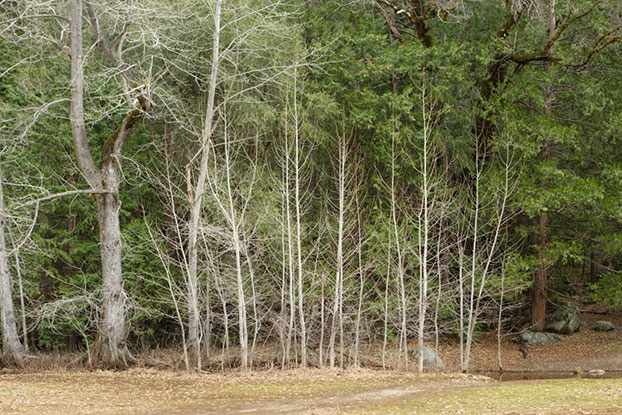
A simple photo looking into a stand of trees.
Of course we have to start in the raw processor- Normally I use Lightroom, but for this demonstration I am using ACR because I can place color samplers to show RGB readings in ACR.
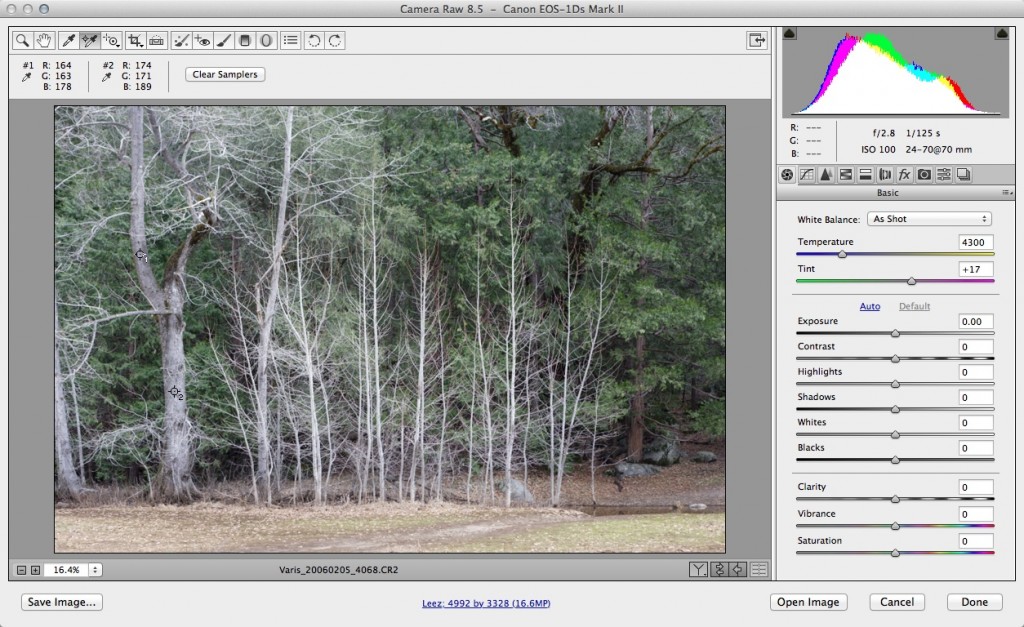
Trees-raw-1
The raw file with color temperature “As Shot” is definitely too cool for my taste. – click on the image to see the full size of the interface!
In the screenshot above, you can see that I’ve placed two color samplers on the tree trunks – the numbers displayed above left of the image show that these trees have a blue bias! As far as I am concerned these trees should either be neutral gray or slightly warm – I opt for the latter!
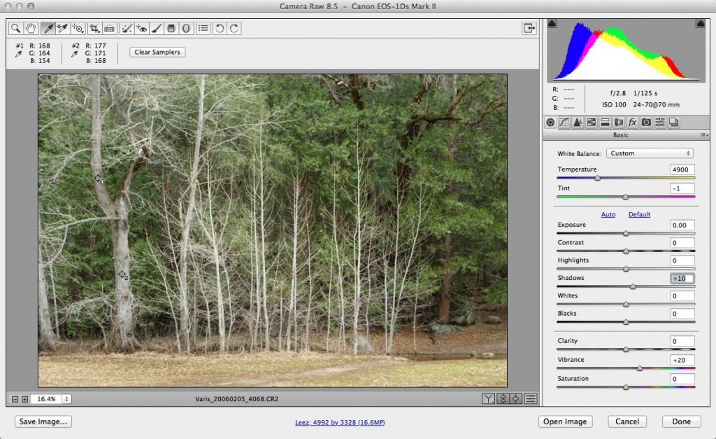
By first clicking on the trunk with the white balance “eyedropper,” and then nudging the color temperature sliders, I get a warmer rendering. A little boost to Vibrance and a slight + setting for shadows is the only adjustment. Again, click on the image to see a full size version of the interface
My first thought here is that I’d like to get the bare branches of the trees at the center to stand out more, to get them to separate from the background of leaves. The 10-channel workflow approach is to look at the individual channels to see if there is a tone or contrast somewhere that can be helpful in the color image. I find my solution in the blue channel…
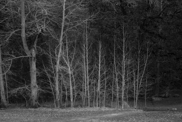
The blue channel has a naturally dark rendering of the green leaves – but the white branches have full brightness here, so they stand out quite nicely!
Compared with the full color version, the blue channel has much darker green leaves, so the area behind the tree branches is much darker. The tree branches, however, are pretty much the same brightness – I can use this to my advantage by putting this blue-channel luminosity into a layer above the image. I will start by making a Channel Mixer adjustment using the “B&W with Blue Filter” preset…
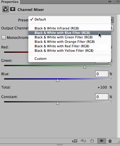
Using the B&W with Blue Filter preset creates a B&W rendering based on the blue channel.
Changing the Layer blend mode from Normal to Luminosity…
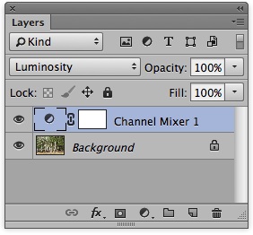
Changing the blend mode results in the blue channel tonal rendering applied to the color image
Results in this darker rendering…
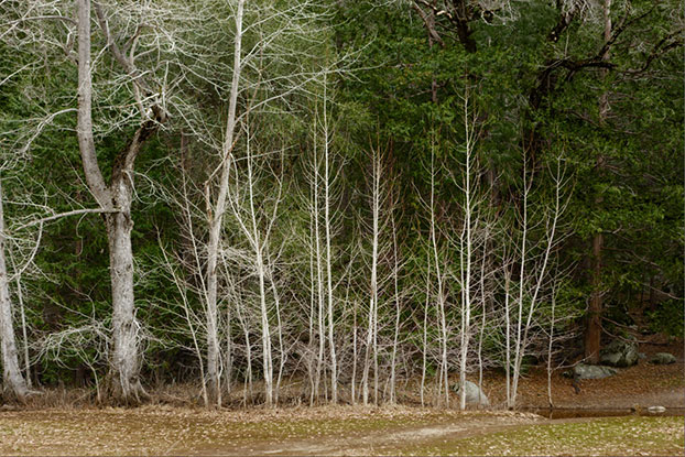
The darker green leaves display the center trees better.
But I don’t want this darkness everywhere – just behind the center trees! So… I invert the layer mask for the Channel Mixer layer, so its black (hiding the darkening effect) and paint into the area of the trees with white so that I can apply the darkening just in the area where I want it! I also darken there foreground for good measure…
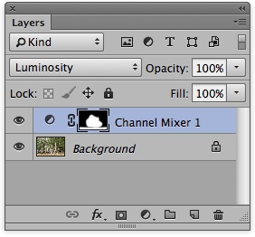
Now the layer mask is only white where I want the darkening effect.
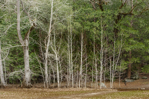
Now it looks the way I want it- there is a natural darkness behind the trees that creates more of a sense of depth.
Now, I know that I want to boost the color a bit, and I could do that with a Curves adjustment or a Hue/Saturation adjustment, but whenever I see green foliage, I think of using the “b” channel in Lab. I can also get much more color out of Lab without damaging the channel structure of the RGB image. So… first I will duplicate the document…
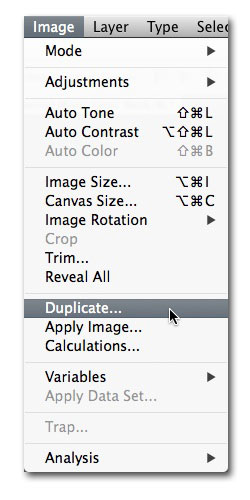
Duplicating the document so I can get a copy into Lab

Rename the duplicate “lab” and check “Duplicate Merged Layers Only”
I change the “Mode” to Lab…
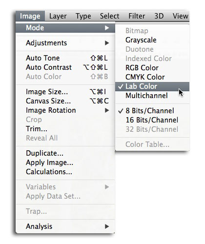
Now… to enhance the color saturation I add a Curves adjustment layer to the Lab duplicate like this…
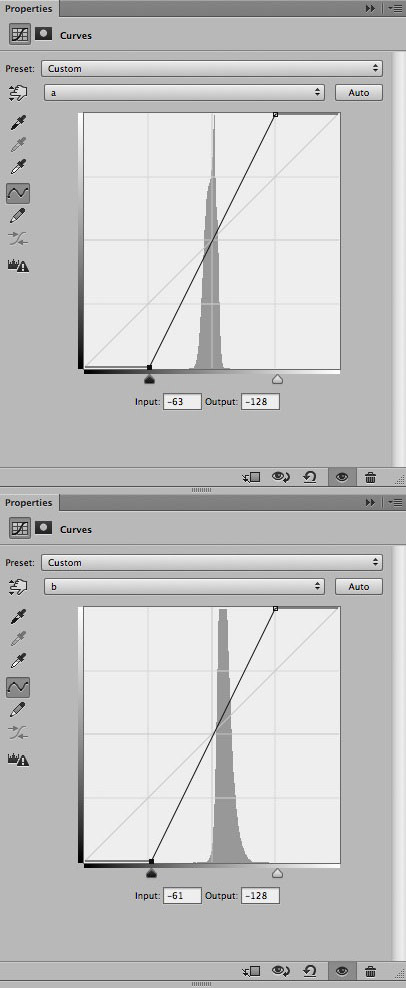
The steep curve creates a lot of contrast in the a & b channels, and this creates enhanced saturation.
Now this duplicate looks like this…
The super saturated version.
Too saturated to use by itself, but I am doing this for the sake of the “b” channel, which now looks like this…
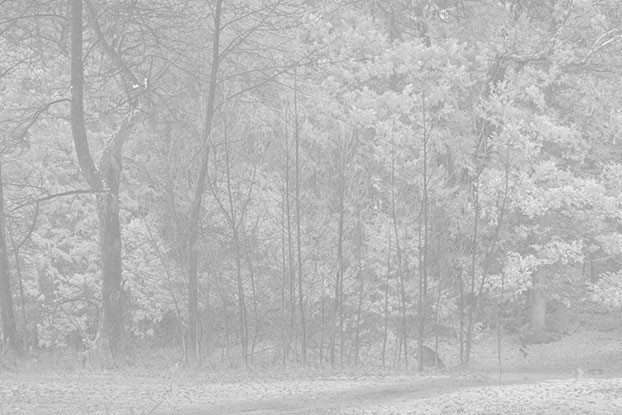
In the “b” channel anything that is lighter than medium gray is more yellow, darker would be more blue – here the brightness of the leaves is based on the amount of yellow color in the leaves.
This odd, low-contrast rendering of the image is very useful for an overlay blend to create a sort of highlight popping of the green leaves. I want to apply this selectively, so I will put a copy of the “b” channel into a layer in the original RGB document. To do that I will use “Apply Image” from the Image menu…AFTER making a new empty layer at the top of the original RGB document layer stack!
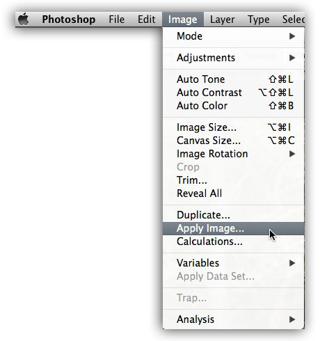
Setting up the resulting dialog like this…
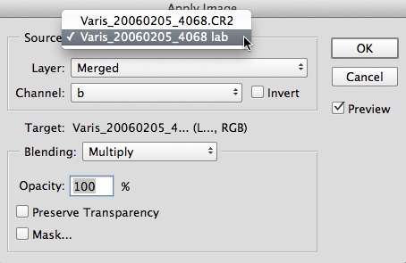
Making sure to set the source as the “Lab” duplicate.
This will place a copy of the ‘b” channel into the empty layer – I then change the blend mode to “Overlay” from the mode drop down in the Layers panel…

Then I use a similar approach to the Channel Mixer layer – create a black layer mask and paint in with white where I want the Lightening effect to show up…
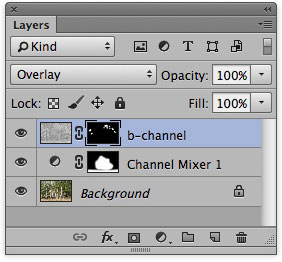
The lightening is applied to suggest the some of the clumps os leaves are coming forward…
I want to create a 3D effect with some of the leaves coming forward, framing the bare tree branches in a kind of dappled sunlight effect. Next I will flatten the lab document and drag a copy back onto the original RGB document putting an enhanced color layer at the top – I change the blend mode to Color so that I can control the contrast and tone underneath it if I need to later…
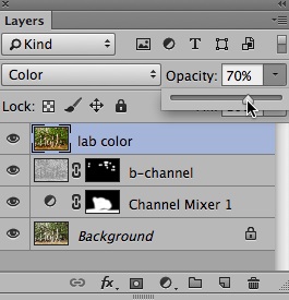
The lab color is too intense, so I change the opacity of the layer to dial down the color a bit…
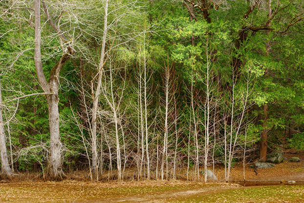
The more saturated color version…
Finally, I set the black point and do a subtle tweak to the contrast with a curve – I get the idea that the green should be just a little less yellow, so I put a Hue/Saturation adjustment on top to shift just the darker green towards blue to get a bit more of a Kelly green look, keeping the highlights towards yellow. This creates the final look, but leaves all the control in separate layers so I can tweak this after I’ve done a test print, if I need to fine tune it further…
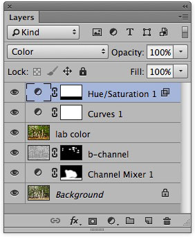
Final Layers.
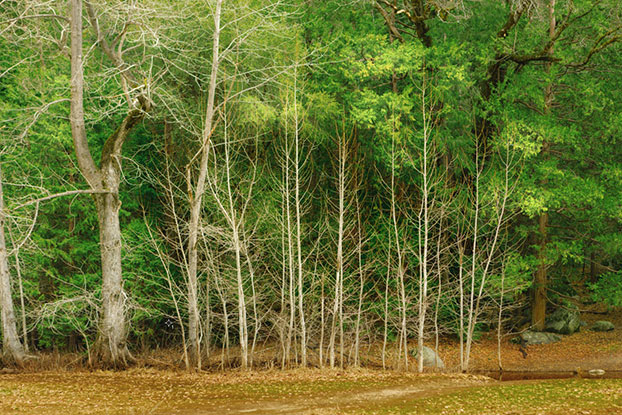
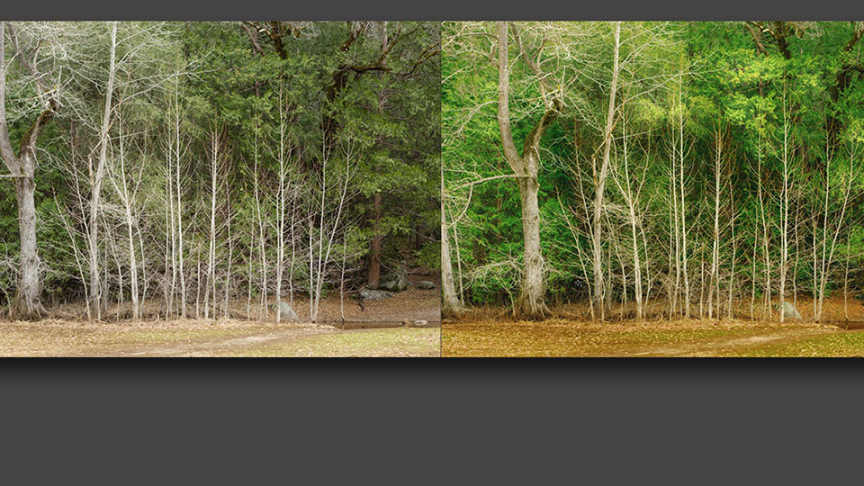
The final version – compare this with the original.
Now this may seem like a lot of trouble to go through to enhance this particular image, but I assure you that once you are comfortable with the conceptual foundation of these techniques, these moves become easy and quick to apply. No tedious masking, the control over highlights is much better, and the results more natural looking than any other method. Look at the layer stack – it is actually quite simple, but each layer allows for almost infinite control over tone & contrast, color, and hue with separate layers.
If you are particularly ambitious, you can click the first image to download it and follow along with my steps…
I have some additional posts that examine this 10-Channel Workflow in different ways – you can get to these from the links below:
I am working on creating a comprehensive online course in the 10-Channel Workflow so stay tuned – I will have several hours of step-by-step video instruction available by the end of the year!
