Despite the wishes of most avid photographers, the photographic image is not really finished at the moment of capture. Every image can benefit with some level of post processing, even if it is just a modest adjustment in white balance or contrast. Most people never realize the potential of a captured image because they stop well before exploring all the enhancements that are possible. It is my belief that you don’t really know how good an image can be until you’ve pushed it too far!
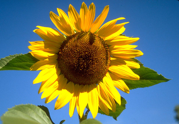
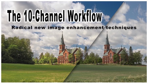
I have a basic image enhancement workflow, I call the 10-channel Workflow, based on the ground breaking work of Dan Margulis, that attempts to push beyond the normal limits of image processing to deliver a stunning level of color and tone. This process takes advantage of the unique tonal rendering of the individual channels of an image as it can exist in the three major workspaces in Photoshop. Consider, for example, this simple image of a sunflower:
All color images are made up of grayscale “channels” that differ in tone rendering
This simple image can exist in a number of different formats, but if we consider just the three major color workspaces: RGB, Lab, and CMYK, we can see that any image can be thought of as having 10 unique grayscale rendering for each of the channels:
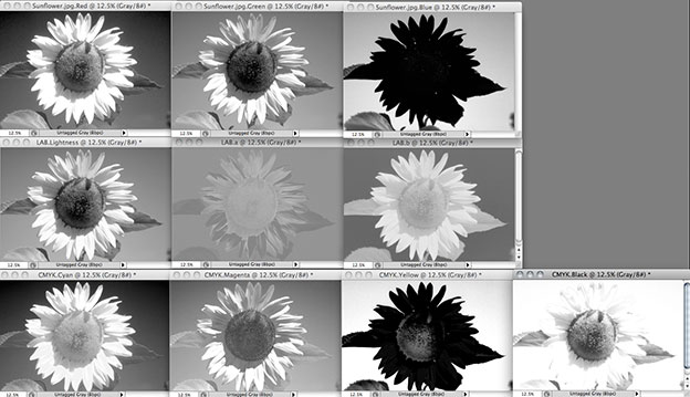
Starting from the upper left – the image as it exists in RGB, Lab, and CMYK
We can utilize the different tonal renderings in the grayscale channels to re-map the luminosity of the color image in ways that go beyond what is possible with the various sliders in ACR/Lightroom, and the normal adjustment controls in Photoshop. I will explore some of these different techniques in a step-by-step image enhancement of the following image, starting in Adobe Camera Raw, but before we begin Lets change our workflow options (click on the little blue hyperlink at the bottom of the ACR dialog:
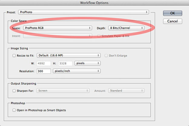
Change the “Space” to ProPhoto in the Adobe Camera Raw workflow options dialog.
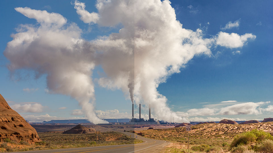
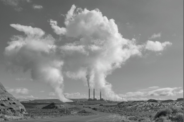
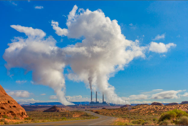
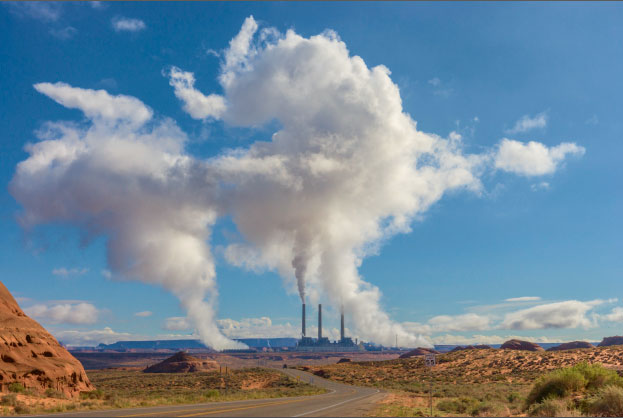
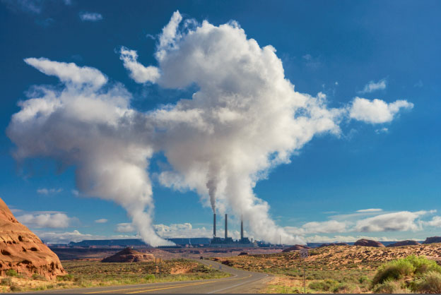
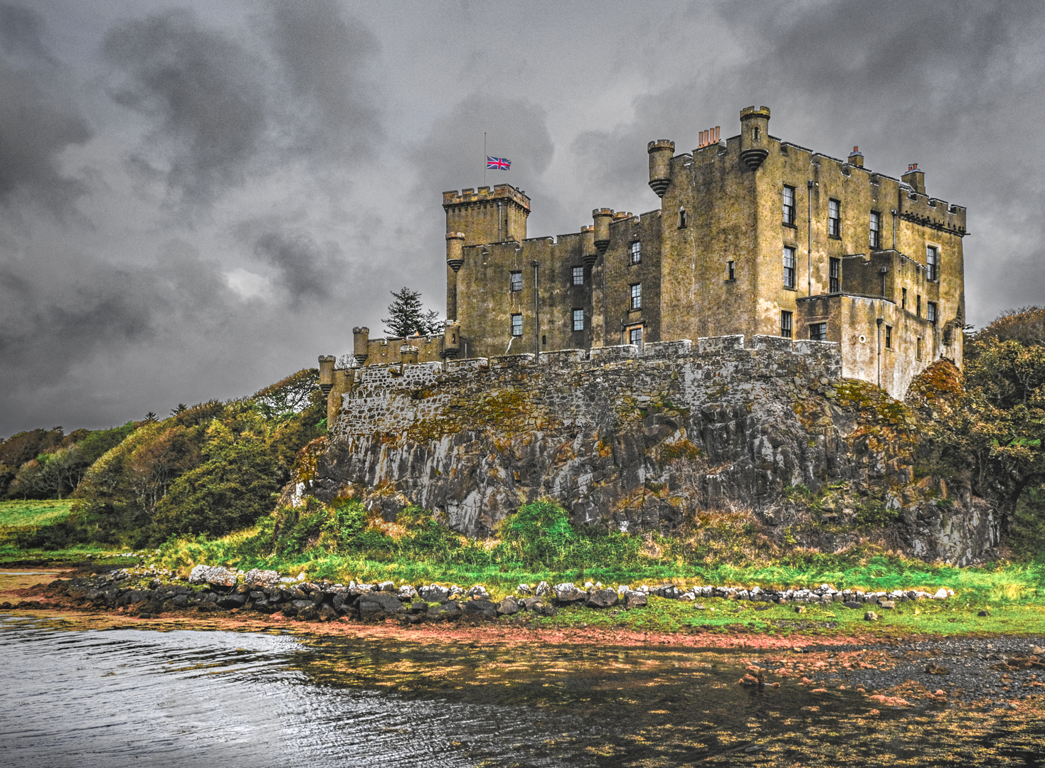
Those of you that know me, may remember that I am not a big fan of working in ProPhoto RGB – I find it a singularly difficult and inadequate editing workspace. There is, however, one exception , and I would be remiss if I didn’t mention it here. When working on landscape images with a clear expanse of blue sky, especially a sky with any kind of gradation, the red channel is very dark and often chunky, or slightly posterized in sRGB (my usual preferred workspace) or even Adobe RGB. We are going to be doing a number of calculations on the individual channels that will stress the contrast of the individual channels, especially the red channel. The red channel of the ProPhoto RGB colorspace is much smoother & lighter in blue skies, so it responds better to the types of stresses inherent in this workflow. For this particular class of imagery, I recommend that you open the Raw file into ProPhoto RGB and stay with that through the bulk of the manipulations. (there is no particular benefit to working in 16 bits for the workflow, so I stick with 8 bits) At the end, I simply convert into sRGB and there is no visible difference! I’ll go over all this again at the end – for now, here is the image in its original Raw, unadjusted state…
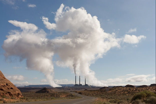
Here is the image in its neutral starting place in ACR – no adjustments, white balance as shot. The white steam clouds from this power plant have skewed the exposure so that the foreground is rendered too dark.
Some modest Basic Panel adjustments get a more pleasing image but here we’ve maxed out the shadow and highlight sliders – not always possible with every image without introducing unwanted artifacts…
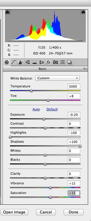
Neutralizing the color temperature by clicking on the clouds with the white balance tool, lowering the highlight slider to -100 and raising the shadow slider to +100, plus Vibrance for the blue sky, and plus saturation for the red rock foreground.
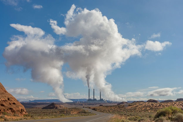
The adjusted image is more pleasing but it could still be improved.
At this point, most would stop and call this image done, as good as its going to get, but doing so would miss out on the full potential for the image rendering. We could perhaps push the saturation a bit more, but I prefer to be conservative here because it so easy to add more color later on. The next step, after opening in Photoshop, is to examine the individual channels to see if any one channel has a better tonal rendering as far as contrast and detail. Most of the time, with landscapes like this, the red channel looks better overall. So… lets turn the image into a B&W rendering using the red channel – apply a Channel Mixer adjustment layer…
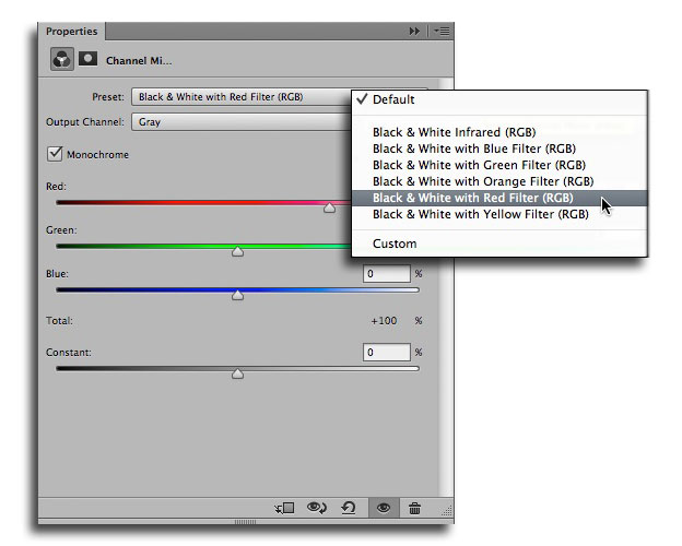
Select B&W with Red Filter from the Presets menu.
The result of the Channel Mixer adjustment layer
By using the B&W with Red Filter Preset, we get the grayscale rendering of the red channel – now we change the layer blend mode from Normal to Luminosity…
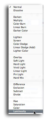
Changing the layer blend from Normal to Luminosity applies the B&W tone & contrast to the color image for some surprising results.

The new color version has a darker sky and lighter foreground.
Now lets look at enhancing the color saturation. Of course this could be done with a Hue/Saturation adjustment, but we will do this another way to gain access to the channels of the Lab version of this image. Duplicate the document (Image-> Duplicate…) check the Merged Layers checkbox & rename with Lab…
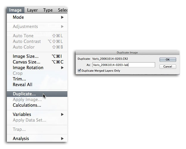
Duplicate the image…
Convert this duplicate to Lab…
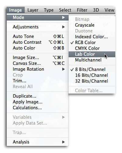
Image-> Mode-> Lab Color
Now we will use a little trick to boost the saturation. First apply a Curves adjustment layer, but don’t make any changes to the curve. Then change the layer blend mode to Overlay…
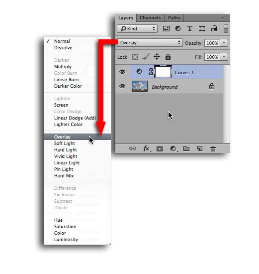
Change the layer blend mode to Overlay…
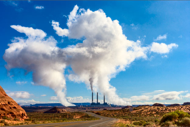
Hyper contrast & color from the Overlay blend…
Having the image in Lab gives us a unique way to achieve hyper color saturation without added tonal contrast – we use advanced blending options…
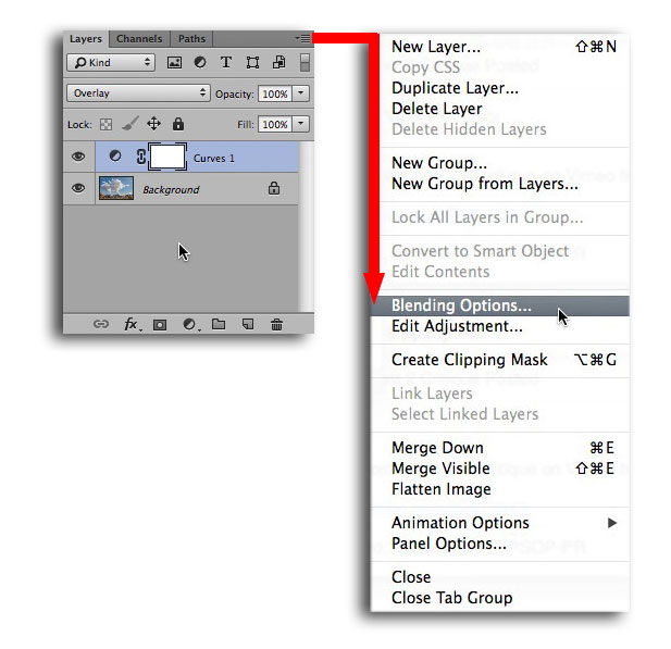
Select Blending Options from the Layer options flyaway menu…
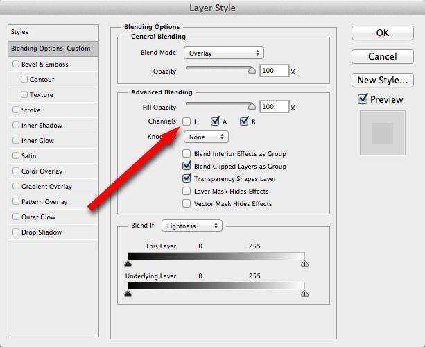
Uncheck the “L” channel to remove the contrast effect of the Overlay Blend…
The result leaves only the extra saturation from the a & b channels…
Super saturated color without the extra contrast…
Right now, its way too saturated, so we will blend out some of the saturation using the Blend If area at the bottom of the Blending Options dialog. Pulling the black and white sliders in to the center of the b channel gradient, has the effect of removing the saturation from blue and yellow colors – split the little triangle sliders by option/alt – dragging them apart. Setting the sliders as shown will bring in just enough extra saturation…
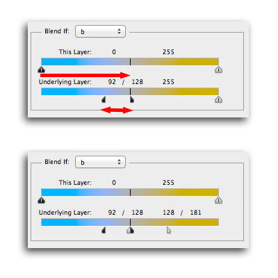
The Blend if sliders can be used to control the saturation…
It is way too easy to push the saturation beyond the limits of human vision in Lab so it can be very helpful to use the gamut warning under the View menu while you are adjusting the saturation. Go to the view menu. By default the Proof Setup is at Working CMYK – this is perfect for our our needs so just check to make sure its set there, and then turn on the Gamut Warning by checking it…
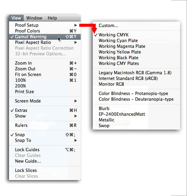
Use the gamut Warning while you are adjusting the saturation to make sure you don’t end up with a blue sky that is too saturated!
Adjust the saturation until the flat gray color goes away from the areas of interest…
Now the overall saturation is where we want it…
Now I’d like to shift the green in the foreground bushes towards a cooler, more Kelly green color. This is easy to do with a targeted Hue/Saturation adjustment layer…
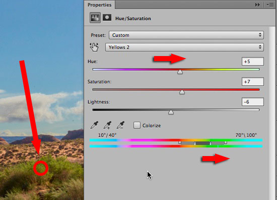
Change the target colors from Master to Greens and click in the image with the left most eyedropper that appears. the dark gray area in the bottom gradient will move to center over the targeted color.
Here I’ve shifted the hue to the right towards green, away from yellow just a bit to liven up the color of the green bushes. You can leave the Gamut Warning on just to make sure you don’t shift the colors into something too extreme, but certainly after you’re done, you can turn it off.
At this point you can flatten the Lab duplicate. Then, very important, hold down the shift key, use the move tool to drag from inside the Lab file over to the Tab for the original RGB file, wait until the window comes forward, and drag down into the window – let go of the Mouse! The color enhanced lab version will convert to RGB and drop onto the layers in perfect registration. If not, try it again – it can take a bit of coordination, but once you get the hang of it its easy.
Latest color enhanced version.
At this point I usually change the layer blend mode to color, as this leaves open the possibility to change the contrast with the underlying channel mixer or some other adjustment without distorting the color. So, we have the Lab color (even though its now in RGB) sitting on top of the other two layers in color mode…
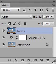
Color Mode
Now for the really fun stuff… make a new empty layer at the top of the layer stack. Then select Image-> Apply Image… from the menu bar at the top…
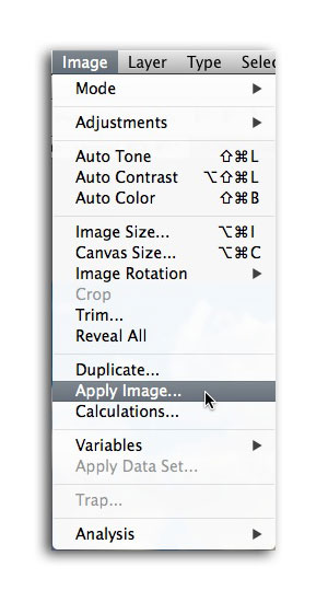
Apply Image…
We are going to grab a copy of the b channel from the Lab document and put it into that empty layer. Set up the resulting dialog as shown…
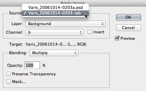
The ApplyImage dialog – make sure the Source is the Lab document and the channel is set to “b”
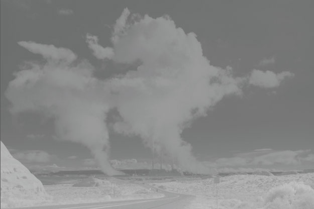
The grayscale “b” channel is now in a layer onto of everything else!
The grayscale “b” channel has a unique tonal rendering that makes it especially well suited to applying it in Overlay blend mode…
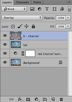
Change the layer blend mode to Overlay…
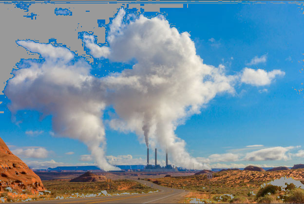
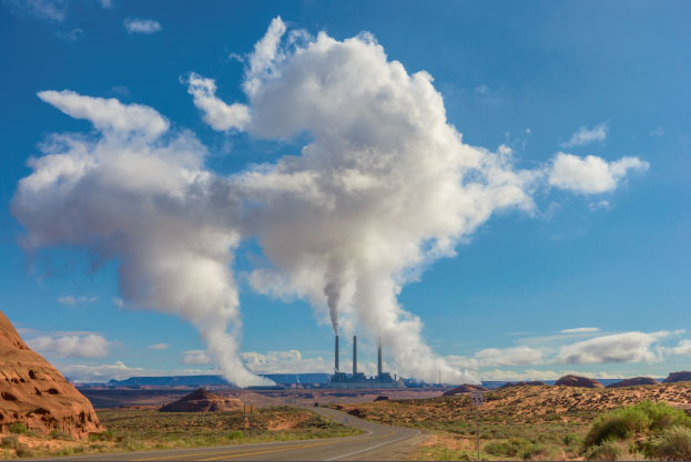
The final version – compare with the Raw adjusted version…
This final Overlay blend darkens the sky and lightens the foreground even more! This dramatic improvement is not possible with any other combination of adjustments, and it all happens through blending of the different channels into the color image.
At this point I usually convert the image into sRGB from the working ProPhoto RGB but its not strictly necessary unless you’re going to send it out for prints at the local drugstore, where you cannot necessarily trust that they will handle the color management correctly.
It is interesting to observe that there is no discernible difference in the image once you convert it to sRGB – you are always looking at an sRGB rendering of the color on the monitor anyway (unless you have one of those expensive monitors that can show Adobe RGB color) and certainly for most natural color images sRGB is perfectly adequate. However, looking at a detail of the sky – in color, no difference between sRGB and ProPhoto RGB…
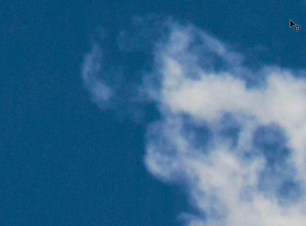
Full color looks the same in both color spaces.
In ProPhoto the red channel looks like this…
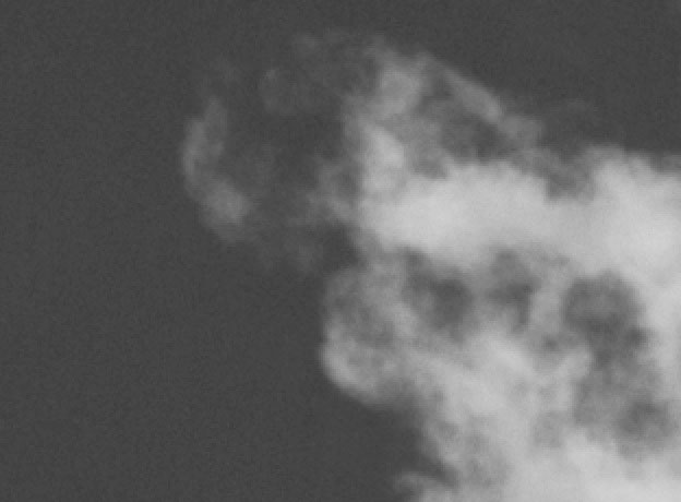
ProPhoto Red Channel…
In sRGB the red channel looks like this…
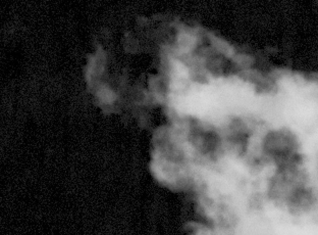
sRGB Red channel…
There is a lot more contrast in the red channel here in sRGB and this is why it can be somewhat problematic for channel blends that rely on the red channel, as in that first Channel Mixer luminosity move we used. The helpfulness of ProPhoto RGB in this case is due to the somewhat smoother red channel rather than any inherent color quality. This advantage is not so obvious for other subjects. Portraits have a lighter red channel and so they don’t suffer from the red channel defect in sRGB and subjects with strong green content are also fine in sRGB, so most of the time sRGB is fine for this channel blending strategy.
I am teaching this workflow in great detail for three different genres: landscape, still life, and portraits, in my upcoming “Image Enhancement Workflow” workshop in Santa Fe, June 22nd – 27th – I encourage you to sign up if you have any interest in dramatically enhancing your imagery – sign up here:
http://www.santafeworkshops.com/photography-workshops/workshop/1311
I have an older video tutorial of this technique, using a different image, that you also may find useful – 4 parts on Vimeo – see it here:
Stay tuned for more color correction blog posts with a variety of images in the near future – here are previous posts on color correction –
Color Correction for Best Skin Tone
Desaturate Shadows for 3D Contrast


Trackbacks/Pingbacks