
Everyone would agree that a great photo starts with a great capture—good composition, good light, good exposure, and a certain ineffable quality of magic that comes together at the moment the shutter is released. However, a great photo is not really finished at the moment of capture. That capture, however great it is, exists as pure potential until it is rendered viewable to an audience. Many times the full potential of an image is never realized, either through neglect or ignorance, or simply settling for some default! My mission has been to discover the best possible rendering of an image by working the raw capture with whatever tools become available. This is an ongoing process that has been evolving for many years, and continues to evolve to this day.
I have mentioned before that it is very helpful to practice with other photographers images, because you are often more objective when you do not have a personal memory of the scene as captured. I thought I’d share my creative photo-rendering process in this post using a spectacular image captured by my fiancé Bobbi Lane. This was captured during one of her travel workshops in Ethiopia. The raw file default rendering shows up in Lightroom/ACR like this:
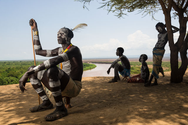
The default rendering in ACR lacks detail in the sky and has dull color.
I tend to use Lightroom as a comping tool, applying adjustments to see what the image might look like, with the full knowledge that I will work up the image in Photoshop using more refined techniques to get better quality. My initial Lightroom adjustments yielded the following:
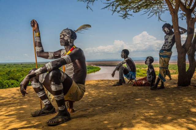
Lightroom adjustments attempt to put in more color and detail in the sky.
The slider settings necessary to arrive at this rendering look like this:
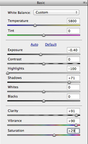
Pulling the highlights down, shadows up, adding Clarity, and color – seems like the right thing to do!
At this point it becomes clear that there is too much haloing around the seated figure – closer examination reveals that the extreme slider settings are resulting in edge artifacts that look like bad chromatic aberration.
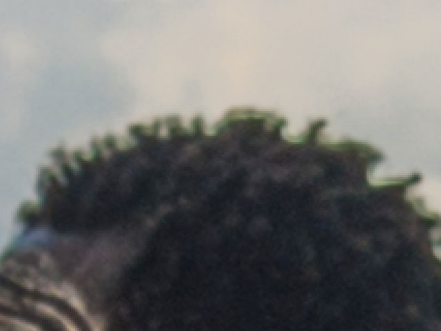
The edge artifacts occur at the intersection of highlights and shadows that are being pulled in opposite directions.
At first glance, the Lightroom adjustments seem reasonable, and for web delivery they might pass. Once you zoom in, and really look at the detail, you start to see all sorts of problems. Bobbi initially thought that this was a lens issue, but really it is the result of Lightroom adjustments that are pushed a little too far! The solution is to combine two different renderings of the raw file in Photoshop – one for the sky, and one for the figures.
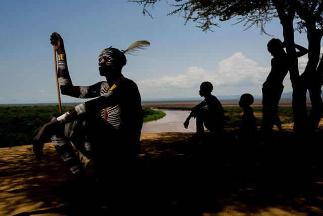
Here the exposure slider was pulling down without trying to compensate in the shadows.
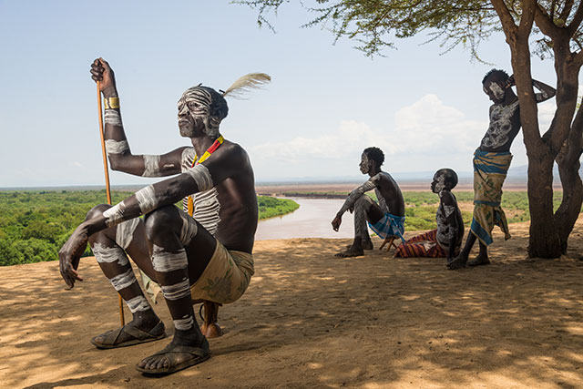
The exposure opened up without compensating the highlights.
I built a mask from the blue channel of the sky rendering file and worked it to blend the edges and selectively darken areas of the image..
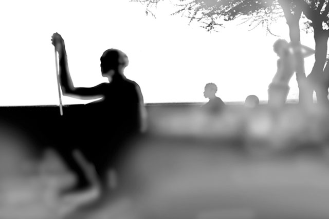
The mask that was used to blend the two exposures together.
Here is the result, blending the two exposures through the mask:
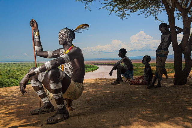
The sky was easily isolated with a mask resulting in a seamless blend.
Next a selective curve edit brightens and neutralizes the clouds…
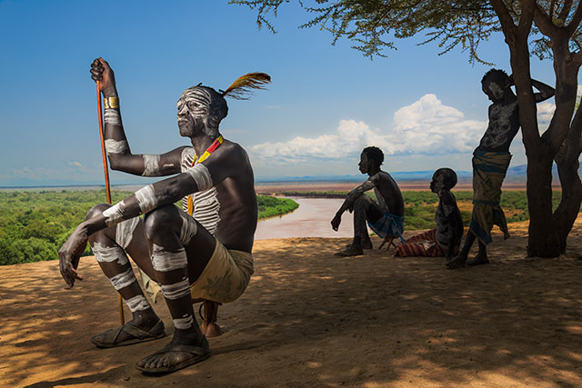
Clouds brightened and neutralized.
The final image has the color intensified in Lab, a Curve to set black and white points, and some Highpass sharpening…
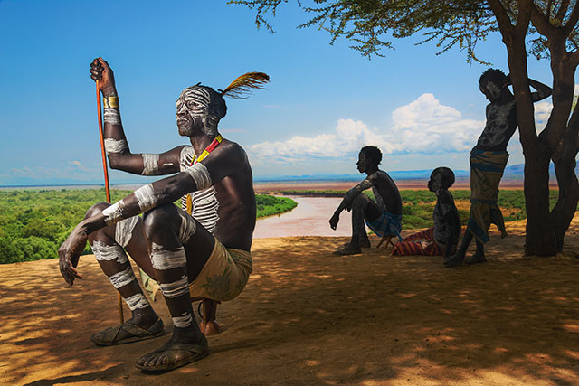
The final image – compare to the Lightroom rendering below!
The original Lightroom rendering…

The Lightroom adjustments seem lackluster by comparison.
Part of the reason there is such a difference between the two versions is that the process of working the image in Photoshop led to some discoveries that changed how I thought about the image. Looking at the darker version, I felt like the boys in the background should submerge into the shadows more, drawing attention to the seated man. The highlights on his painted skin were brightened to add additional presence and the ground was made darker, richer, and a bit more red to take it away from the mustard yellow color. As good as Lightroom is, it definitely has more limitations than Photoshop and attempting to finish the image in Lightroom would cause all kinds of problems that would be harder to fix.
Could we get a better rendering out of Lightroom than what I show here? Yes, but there would still be halos and edge artifacts, and these would be harder to fix, and would still require a trip into Photoshop. Sometimes you can end up with something very useable with Lightroom alone, but I would suggest that you can always do a better job with an image if you are more conservative in the raw process stage, and do most of the adjusting in Photoshop, even if the image does not require any serious retouching.
I will be teaching a workshop about my “Image Enhancement Workflow” in Santa Fe, June 22nd – June 27th, 2014. For more details about the workshop and to sign up go here:
http://www.santafeworkshops.com/photography-workshops/workshop/1311
For another small taste of what I will be covering see my blog post about my 10-Channel Workflow here: https://varis.com/2014/04/29/image-enhancement-workflow/



Trackbacks/Pingbacks