The Pleasures of Lightroom 4 Process Sliders
Every personal photo safari I go on is a great learning experience, and often this extends to discoveries in my post processing experiences. Fortunately, I have been working with the new Lightroom 4 for a while before its release, so I was ready to put the program to good use on the Death Valley images. You can find my mini review and evaluation of Lightroom 4 and its application to my Zone System in a previous post here:
Lightroom 4 and the Digital Zone System
I have become more comfortable with the new process sliders since then, and I’ve made some interesting discovers on some of the new Death Valley images. In general, this new version of Lightroom offers more extreme adjustments, without introducing edge artifacts. The way that the Basic Panel sliders work on sections of the histogram, to lighten or darken tonal regions of the image, suggests a new strategy for image adjustment. The following screen shots illustrate the range of each slider by highlighting (in lighter gray) a section of the histogram for one of my sand dune images:
The Exposure slider operates on the middle of the histogram:

The Exposure slider works on the middle range of the histogram.
The other sliders work on distinctly different areas — here is the Highlights:

Whites

The Whites slider works on the upper most tones.
Shadows

The Shadows slider works on low tones.
and Blacks

The Blacks slider works on the bottom range of the image.
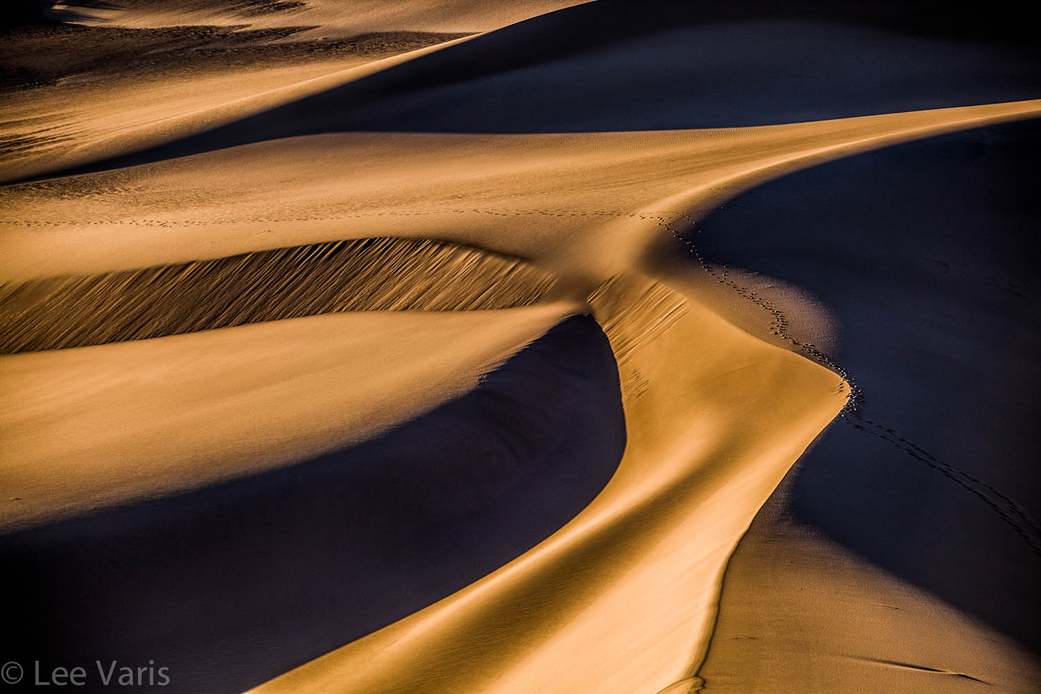
These regions are connected to each other such that there are no tonal cross-overs from one slider to the next, and each slider will drag the end points of the slider regions on either side of it, so that there are no gaps introduced between slider regions. This has some interesting implications. For example, here is one of my dune images, as shot, with zero slider settings:

The unaltered sand dunes, as shot.
The image is nice and has a fairly full range of tones that occupy the middle region of the histogram. My first reaction is that I’d like to increase the drama with additional contrast and texture. The diagonal highlight, in the lower half of the frame, has some subtle modulation that I’d like to enhance. This area is currently falling in the Highlights region of the histogram – if I can stretch the tones apart in this region, I can get more tonal separation in that area, and create more contrast. Most of the textural interest in the image is in the sunlit sand, and I’d love to bring that out as well – this also suggests that I should stretch the tones further apart in this region. I’d like to avoid having the shadows fall into complete blackness, so I don’t want to push the shadow region lower, but I wouldn’t mind getting some smaller area to go absolute black.
Look at the following slider settings carefully:

These slider settings stretch the tones in the highlights and shadows to put loads of contrast into these local regions.
The basic strategy here is to darken highlights but lighten whites—lighten shadows but darken blacks, essentially stretching the tones apart in these regions. The Exposure slider is used to drag the highlights region further down from the whites, to maximize the “stretch” in the upper tones, and really enhance the contrast and texture there. Here is the result in the image:

The enhanced version of the Sand Dunes image
The Blacks slider partially compensates for the lightening of the shadows so that we get enough contrast into that region—my goal was to be able to see into the shadows a little bit, but still maintain a sense of deep shadow contrast for the overall effect. In the previous versions of Photoshop, this would have been impossible to achieve without introducing some unattractive halo artifacts in the edges of the dark shadow regions. The settings in the presence section of the Basic sliders: Clarity enhances the textural contrast, and further enhances the local tone contrast in highlights and shadows—the Vibrance slider brings out a little of the blue color in the shadows—the Saturation is used to reduce the orange color of the sand, to prevent color posterization in the highlights. This last move is very important in Lightroom! Whenever you enhance the contrast with the sliders, you will introduce additional saturation, and the only way to control that is by using an anti-saturation move in the Saturation or Vibrance sliders.
Things get really interesting for B&W conversions in Lightroom. Click on B&W in the HSL Panel and this image turns into this:

The B&W version can be enhanced with moves in the HSL sliders.
Here we can further enhance the contrast by working the color sliders in the HSL Panel:

Here the B&W Adjustment sliders darken or lighten different colors in the image to stretch the tones.
This is fairly subtle, but the highlights are slightly more yellow, and the mid-tone regions are more red, with orange in between. You can see the effects of the slider moves in the image, so its not so much a guessing game as it is a “tweaking until it looks good” process!
Things get very interesting when we introduce a split tone effect that enhances contrast through color— here are the Split Tone slider settings:

The Split Tone sliders use a lighter color in the highlights and a darker color in the shadows.
and here is the result:

The cool highlights and warm shadows create a subtle 3D effect that goes beyond a simple monochrome image.
I’ve used a fairly noticeable color tone here, but even a more subtle (less saturated) split tone effect would have a similar contrast stretching effect that can enhance the monochrome image contrast.
Here is another image where I really wanted a lot of stretch in the highlight tones to get extra contrast and texture in the light caked mud:
unaltered:

The unaltered caked mud, as shot
and with contrast enhancing moves in Lightroom 4

The same image after contrast enhancing moves in Lightroom 4
Here are the slider settings that were used:

Here, big moves were used to really stretch the highlight region, and put as much contrast as possible into the cracked, caked mud.
Here, Highlights and Whites are really pushed, and the Exposure slider is also lowered way down to -3.45 to drag the low end of the highlights further away from the whites. This really stretches the tones in the highlight region to force a lot of contrast into a very narrow tonal region of the image.This has the effect of creating a lot of texture and dimension in the cracked mud. Lightroom 4 offers much more detailed control over contrast in local regions of the image, and extreme slider settings can be used effectively to really stretch the tones in specific areas to achieve enhancements that were previously impossible without going into Photoshop.
Here is a link to other images from my last Death Valley trip:
Well… thats all for now – I decided to save the additional Death Valley Photoshop CS6 insights for the next post—stay tuned for part 3!


The insight provided is critical to an intermediate or even an advanced photgrapher. These subtle changes moves the images from boring to extraordinary.
Thank you for the insight.