Subtle Adjustments Make all the Difference
Every photo needs some amount of adjustment to enhance its presentation, even really good photos can benefit with the right adjustment. However, if you ask 5 different people what needs to be done, you’ll get 5 different answers, or worse, no answers, simply, “it looks fine!” Things become really difficult when there is no obvious problem. There are simple things to check for, like making sure there is a good black point (and possibly white point) in the image to insure that there is maximum tonal range. Other choices are purely personal, according to taste, or creative choice, but careful consideration can often reveal a correction strategy that can bring out the best in any given image.
I think most photographers have a hard time stepping back from the moment of capture in order to really evaluate the image as it would present itself to a viewer who is not intimately connected to the experience of taking the photo. We remember how good our subject looked in our minds eye, and this alters our perception of the collection of pixels that is the result of the picture making process. The truth is that the photo we take elicits a response that is dependent on our memory of the experience – when you take that memory away, as it would be for anybody who was not there at the moment of capture, the response is only dependent on the photo. This is one reason it is so hard for us to edit our own work! Its almost impossible to be objective enough.
I have found that careful attention to basic color correction principles can help re-calibrate our subjective evaluation of an image to a point where effective adjustment choices can be made. I also find it extremely helpful to get as much practice as possible working on other people’s images, as this helps us become more objective about our own work! I have the good personal fortune of benefiting from the work of my fiancé, the amazing Bobbi Lane, who happens to be a really extraordinary portrait photographer! I will examine my decision making process in a recent color correction of one of her images in the remainder of this post.
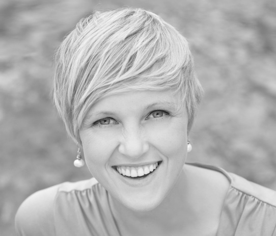
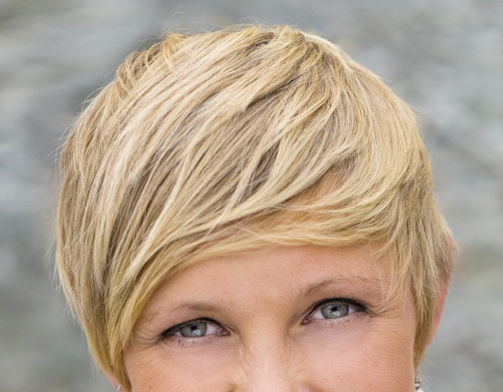
Here is the image as it was given to me, already processed into a Tiff file from the original dng:
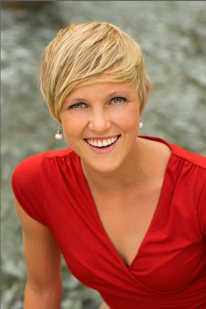
Bobbi gave me this file to look over and make fine-tuning adjustments. This was the result of her Lightroom adjustments.
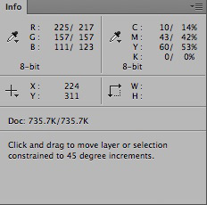
Not bad right? But… there is just something about the color, maybe its just a little too colorful? The skin is approaching what I call the Pumpkin Tone – just a bit too orange! A look at the info panel will confirm this. I move the cursor into the image and hover over some points on the face: forehead, chin, and onto the shoulder and chest. The numbers show just a little too much saturation…
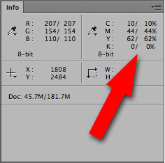
Skin color is best analyzed by looking at the CMY values in the info panel
The screenshot above shows a reading from the skin color at the chin – there are two columns of numbers here because I had already added a Curves layer when I did the screenshot, normally there is only one for RGB and CMYK. The two columns are identical at the moment because no adjustment is being made, this allows you to compare adjusted with non-adjusted numbers. Even though the image is in RGB, Photoshop allows for a secondary set of colors in the info panel. By default, this extra read-out is in CMYK (this can be changed in the panel options drop down at the upper right corner of the info panel.) What I’m noticing here is the ratio of C to M to Y – the basic skin color is good, but… ideally, with a fair skinned blond, I’d like to see the magenta value just a little closer to the yellow value, and the cyan should not be much lower than 1/4 of the average between magenta and yellow. In the numbers above, that average would be 53 – cyan at 10 is just a little low, not horribly low, but that combined with the slightly elevated yellow (relative to the magenta) confirms my suspicion that the skin is just too colorful. In fact, this skin color is very reminiscent of an artificial tan, spray-on type of color that is sometimes used by body builders in competitions!
Another thing I like to do, when analyzing any image, is look at the individual channels of the RGB image. This image shows a very pale red channel with skin values approaching white!
The red channel looks very pale – the skin value is very white.
Now, this image is in Adobe RGB because I haven’t been able to convince Bobbi that sRGB is perfectly adequate for portrait photography, and this affects how pale the red channel is. In Adobe RGB there is a bit darker tone in reds than there would be in sRGB so you have to keep that in mind when judging colors. Adobe RGB can contain much more saturated reds than can be displayed on just about any monitor – even the expensive, so-called, Adobe RGB monitors can only display 98 percent of Adobe RGB and that 2 percent is missing in the reds! Anyway, I digress… I usually check for clipped-to-white values to see if there is a serious problem. This image is easily adjustable with a Curve because there is no clipping in the red channel. However, I do feel that a Curve adjustment might be a bit easier if the red channel were just a little darker. I know that I’m going to raise the blue channel value in the skin to counteract the overly yellow tone, and this will lighten the skin overall. I’d like to keep the value of the skin close to the current, tan look, so darkening the red would help. I could use the same Curve to achieve this darkening, but I’m going to use another adjustment to achieve the same result in an easier way!
The green channel has a much darker skin value, so I will blend a bit of that darker tone into the red channel using a Channel Mixer Adjustment layer…
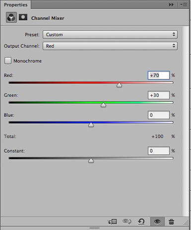
Here the blend of green into red shifts some darker tone into the red channel by reducing red to 70%, and putting back the 30% from the green channel
By replacing 30% of the red channel with the darker tone of the green channel, I get a darker skin value in the red channel…
Using a bit of the green channel into the red channel gives a little bit darker skin tone.
This technique can work wonders to repair a clipped-to-white red channel but it can also make the following Curves adjustment easier by eliminating the extra wiggle in the red channel curve.
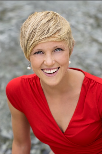
Here is what the image looks like now…
After the Channel Mixer blend the extra yellow in the skin color really shows up and things look worse, but this is just to set up the Curves move that follows.
Now this actually looks worse over all – just remember that we’re not done yet! If you are particularly observant, you will have noticed that there has been some retouching applied here—look at the first image again—I cloned over a dark area in the background and smoothed out a rough area on her chest! It is almost always best to do any retouching in layers underneath any color adjustments. If you change the color later, any retouching done above the color adjustment layers would have to be re-done – save yourself the extra work and keep the pixel-editing under the adjustment layers! At the moment, the color of the hair has become overlay green by the Channel Mixer adjustment, so I’ll take note of that, and plan on fixing it later.
Now for the Curve adjustment…
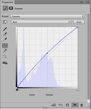
I place a point on the curve in the blue channel, and move it up, brightening the blue to reduce the yellow value in the info panel.
Now the color looks much better!
Raising the blue value has given the skin an appropriately pinker hue by reducing the yellow ratio. I always keep an eye on the Info panel while I’m adjusting the color to confirm that I’m doing the right thing…
The Info Panel numbers confirm that the yellow value has come down and the cyan value has gone up!
Here the Info Panel numbers show an ideal ratio for the CMY values of the skin color. Cyan is between 1/4 and 1/3 of the average value between yellow and magenta – yellow is just about 10% higher than magenta, good for a fair skinned blond. The blond hair has a very slight green cast however – this is something to look out for with blond hair! Its very easy for blond hair to take on a green cast especially in shadow areas of the hair.
The hair has a very slight green cast mostly noticeable in the darker shaded areas.
Now this is pretty subtle but easily fixed with a Hue/Saturation adjustment…
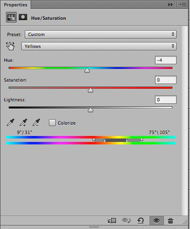
Targeting Yellows, and shifting towards red.
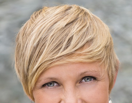
The subtle Hue/Saturation move eliminates the green cast to finish the color correction!
I give more complete instructions for using the Hue/Saturation adjustment in this blog post about shifting the red out of skin – Take the Red Out
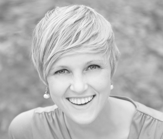
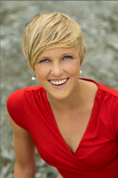
Compare the final corrected image to the original…
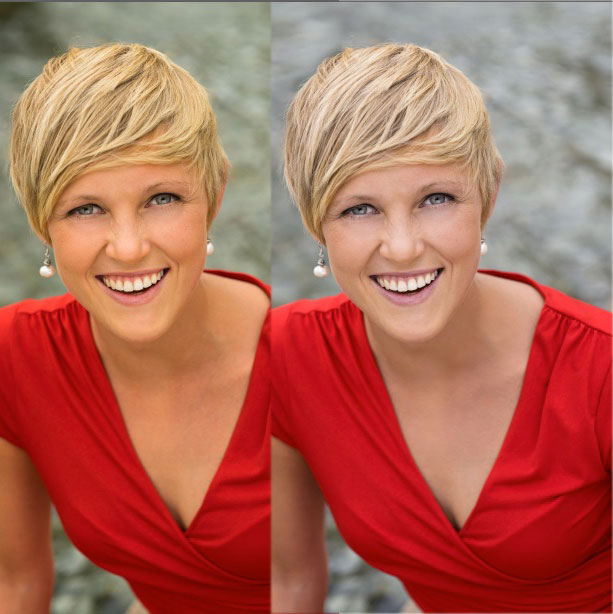
The final image seems much “cleaner” and certainly more natural!
Most people wouldn’t have thought that the original color was particularly bad, and most photographers wouldn’t have bothered to correct it in any way! But it pays to apply a little numerical analysis to any image, just to see if there is anything that could stand some improvement. Sometimes I am surprised to find problems when my first impression was good, but one can almost always improve on a default rendering, and you never know how good an image can look unless you try! The take away here is the Channel Mixer adjustment – try correcting the original image with a single Curve – its possible to improve things, but it requires a more complex multi-point shape in the red channel curve because the point has to be placed very high up, near the upper end point, and its hard to move that point without damaging other parts of the image! The Channel Mixer fixes the problem of red-saturation easily and makes the final curve very simple! You can grab a copy of that first image with a right-click, just remember that everything on this site is copyrighted & this particular image is ©2014 by Bobbi Lane!
If you’re interested in getting some color feedback on your own images, you should consider taking my PPSOP course: Portrait Retouching Fundamentals – this is a 4-week course in Portrait Retouching with video step-by-step instruction, work files and assignments, that includes weekly critiques – sign up here!
I have an in-depth, Portrait Retouching Intensive, coming up Jun 21st & 22nd in Santa Fe, where I will be covering all aspects of Portrait Retouching, including color correction – sign up here!
Have fun with your pixel wrangling!


Thanks a ton for the demo, do you buy chance do skin correction in after effects for video? Or talk about bit depth with secondary corrections? Would love to hear what you have to say about those topics. For example, if there is a significant enough difference between using the GH4 plut atomos shogun to get the 10-bit video or instead just use the A7S with Atomos to get the 8-bit and additional dynamic range. Stuck debating weather to have 10-bit or 8-bit with way better dynamic range.
Cheers!!
Nate
I don’t know how to respond to this comment, as I have no experience with film grading issues or the GH4
Hi Lee. CMYK I use in PS for Skin buy why do LR and Capture One use RGB instead of CMYK. It would be easier to get skin correct in Capture One then PS? Is there a ratio that can be used for CMYK into RGB?
Lightroom does not support number readouts for CMYK, and its RGB number readouts only supply the internal Lightroom colorspace numbers which don’t relate at all to regular workspace numbers like Adobe RGB or sRGB. The color controls in Lightroom also don’t really lend themselves to the kind of precision that you get in Photoshop—the best you can do is visually reference a file color corrected in Photoshop to the CMYK numbers with a raw file in Lightroom, and adjust the basic panel color balance to get as close a visual match as you can. I don’t know anything about the current versions of Capture One—older versions were no better than Lightroom with regards to CMYK number readouts, but at least it supported regular colorspace RGB numbers.
Good advice thank