Best Practices for Better Printing
Well now… finally getting back into posting here after a hectic several months searching for, and purchasing a house, moving into said house, dealing with various government bureaucratic snafus related to change of address, insurance, loans, and taxes, and navigating through the house warming and holiday parties, etc…
I’ve had many photographers ask me about preparing image files for CMYK printing. If you’ve attempted to do this you probably have realized that, to get even adequate results, you have to do something more than just select: Image->Mode->CMYK Color! (scroll down to see a video about the process)
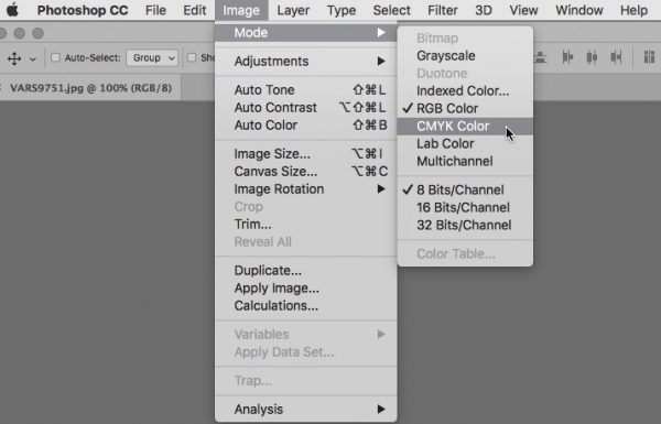
A simple mode change does not often result in a good conversion to CMYK
If you have good information about the printing press you are sending files to, you would certainly use the “Convert to Profile” choice, and use the appropriate profile. However, I have found that very often the correct information is not available, or you are not sure exactly what the print conditions are going to be. Still… you can sometimes make a good guess, and pick a reasonable profile.
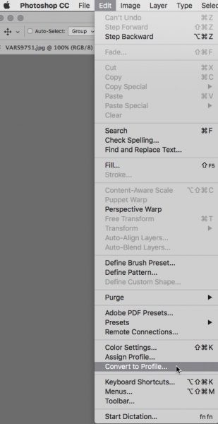
A better option is to select the appropriate profile from the “Convert to Profile” dialog
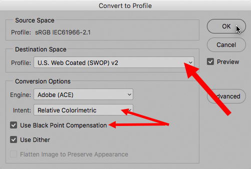
Make sure to have “Relative Colorimetric” set up for “Intent” and keep “Use Black Point Compensation” and “Use Dither” checked—then select your profile from the drop down for “Destination Space”
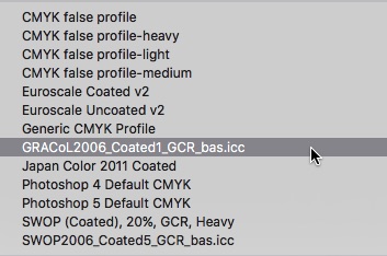
If you have a custom profile for the press that is being used for your printing, it is best to use that specific profile. You’ll notice in this screenshot that I have several special profiles that I use for channel blending and special effects, some Euroscale profiles, a Japan Color profile, as well as some custom SWOP profiles.
Incredible as it may seem today, many printing establishments are unable to present you with a custom profile for their press. Very often you’ll be told “just select U.S.Web Coated (SWOP) v2”
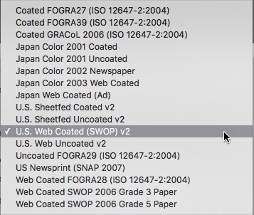
SWOP stands for Standard Web Offset Printing – a web press is typically what magazines are printed with – a more economical, faster method than a sheet fed press.
This is almost always the choice offered even if the printer is using a sheet fed press instead of a web press. Why? Because, historically, the standard sheet fed profiles in Photoshop were were set up for the wrong ink densities, and produced sub-standard results—now most professional printers avoid recommending them. The other big reason for choosing the SWOP v2 profile is that most printing establishments calibrate their printing to U.S. Web Coated (SWOP) v2. Just about all printers will assume a CMYK file is in the SWOP v2 colorspace in the absence of the profile, or they will simply ignore profiles in all in-coming files altogether, and treat everything as if it was SWOP v2! Just about all print shops in Hong Kong print to SWOP v2 conditions as most of their clientele is from the U.S.
Even if you have an appropriate custom profile for the press, a simple mode change does not guarantee ideal results so you have to be prepared to do some color editing in CMYK. The following is provided here as some suggestions for best practices for CMYK color editing!
Selective Color Adjustment
This color adjustment tool is easily the most useful adjustment layer in CMYK.
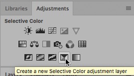
Right after the mode change to CMYK, create a Selective Color adjustment layer.
You will want to adjust blues and yellows if your image has these colors, and you will always want to adjust blacks to get back some of the missing contrast the occurs after conversion. Select the color you want to work on from the “Colors” drop down…
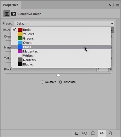
Select the color you want to work on from the “Colors” drop down & check the “Absolute” radio button.
Absolute will give you stronger control over ink densities, which is what you want.
Blues tend to shift towards magenta on press for various reasons, and it is a good idea to build in some compensation towards cyan to prevent skies or other blue colors from looking too purple! You can push the magenta slider into the negative range, and if you don’t want the blue color to get any lighter you can push cyan more positive.
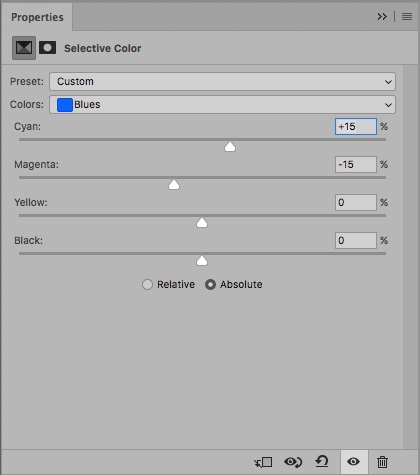
The settings shown here will work well for 90% of all blues in CMYK images.
The color of yellow ink is the only color in CMYK that is more vivid than the brightest yellow in Adobe RGB or sRGB, so typically yellow in an image will convert with too much cyan—this can result in yellows looking a bit green post conversion. Again, Selective Color comes to the rescue by allowing you to subtract cyan from yellows.
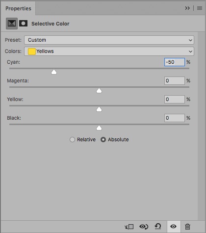
Subtracting cyan is always a good idea—I’ve never seen an instance where even extreme negative settings for cyan harmed yellow colors. If you need a richer looking yellow its much better to have more magenta than cyan!
Finally the most important Selective Color adjustment you can make is for Blacks! For some reason, whenever Photoshop converts from RGB to CMYK, the black point in the image never ends up with the “K” channel close to 100%—there is always room to get more black into the image! This is a little more delicate an operation than adjusting other colors because “Total Ink” becomes a concern. You have to keep an eye on the total ink limit for very dark tones and make sure that it doesn’t go over 300% The Info Panel is your friend here:
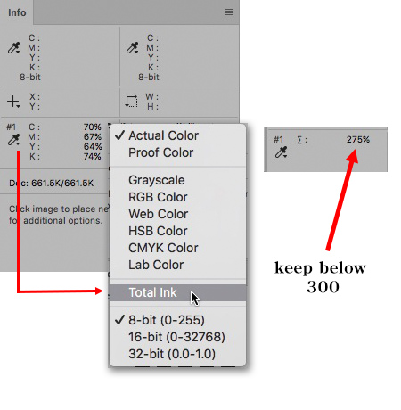
You can place a Color Sampler on the image in a dark shadow and change the color readout to “Total Ink” by clicking on the little eyedropper icon.
When you adjust “Blacks” in the Selective Color adjustment, you need to subtract cyan, magenta, and yellow to match the percentage of additional black you add…
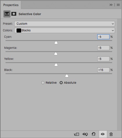
These settings will almost always work to bring the black contrast back into the image after its converted to CMYK.
Black Plate Sharpening
My final “best practice” is suggested if you are looking for a sharper result for your printed image—not 100% necessary for every CMYK image, but its good to know anyway! Most of the time, sharpening the RGB file before conversion is ideal, but if you are looking for a sharper effect, you can consider applying some additional unsharp mask to just the black plate.
Highlight the “K” channel in the channels panel and turn on the “eye” icon for the CMYK composite so that you can view the full color image while you run unsharp mask on the “K” channel…
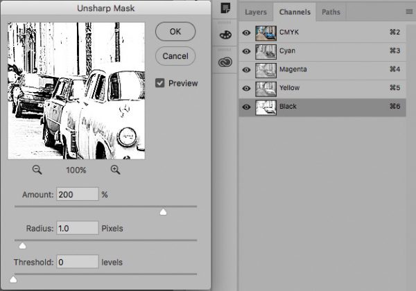
By sharpening only the black, you can create a good sharpen effect without visible halos in the image
I have a video tutorial here that shows these techniques and more for a few example images, so that you can get a better feel for the techniques:
CMYK is an art into itself, and there is certainly a lot more to it than I can cover in a blog post, but these color adjustment techniques will go a long way towards making your CMYK files print better. Good luck in all your printing efforts for the coming year!
