Great Glamour Starts with Light but Finishes with Luminosity
One of the concepts I stress most with my students is that photography is all about the play of lights and darks; tonal value is more important than color! I find that, most of the time, the path to a great color image runs through a B&W conversion, at some point. It is much easier to make tone and contrast decisions when you are not being distracted by color. Once an ideal B&W is achieved, you can apply the B&W luminosity to the original color. The following example, from my last Glamour workshop, shows this process.
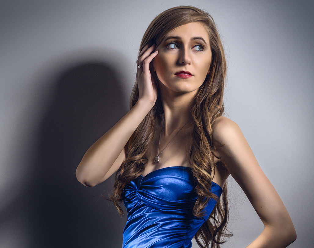
I start the workshop with a brief look at the work of George Hurrell. His classic photography from the 30’s and 40’s was the pinnacle of the glamour style and his lighting was pure genius! I enjoy re-creating this style with modern digital technology. One of my favorite light sources is a digital projector which can throw a very sharp light pattern in any shape you can make in Photoshop! The image below, of the lovely Alyssa, is as it was shot, straight out of the camera, with minimal spotting and adjustments. There are two light sources—a beauty dish from camera right and a grid spot aimed at her torso from camera left. This is the starting point for the journey to an illustrative result.

The quality of light has to be present in a good photograph – you simply cannot fake it in Photoshop.
I usually bring the RAW image into Photoshop with reduced contrast because I prefer to craft the tones in Photoshop rather than try to finish the image in Lightroom or ACR. After checking the color and maybe doing minor color adjustment, I will start exploring a B&W conversion…
The image above is a fairly straightforward Channel Mixer conversion with red at 65% and green at 35%. I then used Apply Image to put a copy of the original Blue channel into a layer above the Channel Mixer adjustment. This layer was clipped to the Channel Mixer layer, that becomes important later on. I then masked it off so I could paint in highlights on the dress (which is much lighter in the blue channel) and shading on her face and arms.

The blue channel “layer” is clipped to the Channel Mixer adjustment – only portions of the layer are allowed to show .
The result is further enhanced with a little dodging & burning in an overlay layer…
Now all I have to do is change the layer blend mode of the Channel Mixer adjustment to Luminosity and I get a new color version with the lights and darks of the B&W—this is why the blue channel layer is clipped to the Channel Mixer adjustment— that way the combined luminosity of the two B&W layers is applied to the color below…
After looking at this for a little while I decided to pump up the color by taking a merged duplicate into Lab color and applying a curve in the b channel…

This curve shape, in the “b” channel, increases the saturation of the blue dress dramatically and also pushes the neutral wall towards blue for a cooler tone.
The Lab color space is much better for increasing saturation than simply using a Hue/Saturation adjustment. It was also very easy to keep the saturation effect off the skin tone. The cooling of the neutral wall behind her created an additional sense of contrast between her warm skin tone and the surrounding environment…
While this Lab version could be the final, I like to drag a flattened copy of the Lab file on top of the RGB layers. That way I can put the enhanced color layer in Color mode and I can revise the contrast in the underlying layers if I change my mind. The final layers look like this:
This process of working an image has become a standard with me. I always look at a B&W version to see if I can enhance tone and contrast in some way before I return to the color. Working an image in B&W often gives me new ideas for the color but it always shows me how much more can be done to enhance the contrast and tone. George Hurrell always worked with an 8×10 view camera in B&W and I think the discipline of thinking in B&W contributed to his way of lighting and retouching his images. I often wonder how George would have used the digital technology we have today to arrive at even better images.
Bobbi Lane and I will be doing a workshop in Los Angeles at the Los Angeles Center for Photography on “Hollywood Lighting in the Hurrell Style,” March 9th, 10th & 11th, 2018, where I will be covering retouching techniques like this one, as well as many others. If you are in the LA area, and would like a more personal lesson in Glamour lighting and retouching – register for our workshop here.





Mind Blowing!
Hello I’m very happy esdras seen him in the bigphotoshow and saw some of their presentations and I liked them but had no money to buy the dvd but I have a small doubt about this topic you have in your blog Evolution of a Glamour Photo is only written and has some photos that work progresses but in fact I do not work when I do step by step you could give that information I would appreciate video or if you have information on a dvd send me the link to buy the dvd Thanks .
Hi Esdras! I have a very detailed tutorial on the same topic in my blog called “Classic Hollywood Glamour” – I show a detailed video step-by-step:
http://blog.varis.com/2012/11/05/classic-hollywood-bw-glamour/
This tutorial is also available on my Udemy.com online course where I also make the files available so you can follow along in Photoshop – the course has 15 different projects that explore different techniques for Photo-Illustration—9 hrs of video plus 2.5 gigs of supplementary material—you can purchase this whole course at a special discount through the link below:
https://www.udemy.com/fundamentals-of-photo-illustration/?couponCode=YouTube50