Guiding the Viewers Eye with Color and Tone
This past weekend I participated in the Adobe Sponsored, Neon PhotoWalk in Las Vegas. Along with about 60 other photographers, I roamed up and down Fremont street in the renovated old downtown area. This “Fremont Street Experience” is a visual feast of gaudy neon signs, and a huge video ceiling covering about 3 blocks of casinos, restaurants, and souvenir shops. A zip-line runs just under the canopy, with riders traveling the length of the street every few minutes! I decided to limit myself to my Lensbaby Composer lens to create very impressionistic dreamlike images.
It would seem that this explosion of color all around would be the major component of just about every image I took. Readers familiar with my photo-philosophy know that I emphasize tone over color in my work. Lets examine this principal at work in a few images from the evening’s shoot…
This is a good overview of the experience that is Fremont street: the zip liners are clearly visible overhead while the somewhat fuzzy, and often intoxicated, crowd walks underneath. A lot of bright color here, but is color the main thing? I find it useful to look at the difference between a color only version, and a tone only version. First lets look at the image stripped of its luminance information with only color. This is achieved by placing a solid 50% gray layer above the image in luminosity mode(in Photoshop)—the result is a single mid-level tone modulated by pure color:
Conversely, if we change the gray layer blend mode to color we get the following, more legible, B&W version:
Here the gray color is used but the lights and darks of the underlying layer create a much more visually intelligible image. No one would argue that color is not important in this image but it is harder to argue the relative merits of color verses tone. Lets look more closely at the overall tonal organization of the image by blurring and simplifying the lights and darks:
In almost every photograph, the eye is attracted to light over dark. Here the large wedge shaped light shape of the ceiling draws the eye down to darkness at the bottom of the frame, then pulls out to the sides in the chaotic bright shapes of the ground level lights. These light shape bleed off the edges taking the eye out of the frame. This little exercise can sometimes provide a clue for further adjustments.
For this final version, I lightened the area behind the figures at the bottom center. This brought out the color reflected on the floor and helps to anchor the ceiling light to the floor at the center. I neutralized the saturated blur chromatic aberration at the lower right and left and darkened these areas slightly to keep the eye from being drawn outward to the lower corners – compare with the original version at the top!
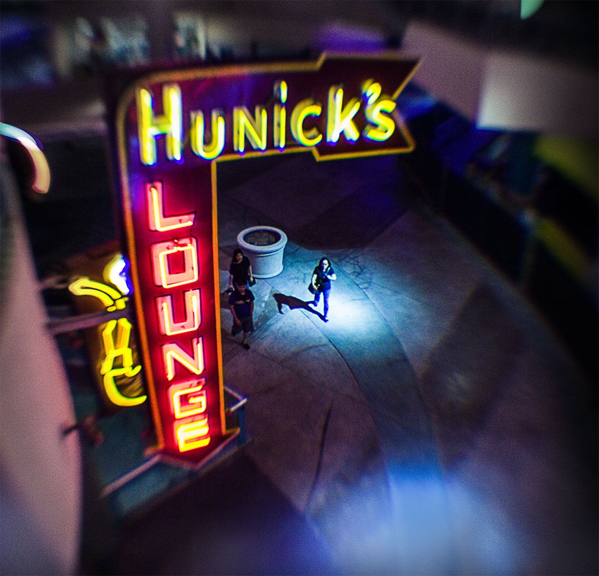
This next image is my favorite from the evening:

No question that lights and darks make this picture. Though colorful, the isolated figure in the pool of light is the obvious focal point; the L-shaped neon sign serves to frame the spot lighted figure.
Here it is kind of obvious that the bright spots of light, in the lower part of the frame, are distracting, and don’t really contribute anything. I really want the pool of light around the figure to be the main attraction, so these other elements need to be minimized or eliminated:
The two bright spots are removed and a similar strategy of de-saturating the colors at the periphery has re-focussed the attention at the center, where all the action is. The eye now bounces around between the figure, the L-shaped sign, and the second pool of light, moving in a nice circle without being tempted away from the center. A simple crop results in…
The final image now really focuses on the center figure and all really distracting elements and dead space have been removed…
The important thing to remember is that bright saturated color can blind us to the most crucial elements of tone and contrast in a scene. Sometimes it is really useful to look at a B&W rendering of a colorful image, just to remove the distraction of color, so you can concentrate on the play of lights and darks in an image. This play of lights and darks is often where the strength of composition resides and this can give us a strategy for strengthening the image. Don’t be afraid to retouch out distracting elements or de-saturate colors that may draw the eye away from the crucial focal point of the image. Try and avoid having bright lights at the edges of the frame—the eye is drawn to lighter elements or areas of greater contrast (a black cat in a snowfield will be the focus even though it is dark)—control the play of light against dark to reinforce the composition.
You can see more of my photos captured at the Neon PhotoWalk in my Flickr set here: Adobe Neon PhotoWalk – these are all, pretty much straight out of the camera with no cropping and only global Lightroom adjustments. Try and imagine what kinds of adjustments can be made, using the approach I have suggested above, to enhance these images…







Lee thank you so much for your help on the Photowalk…and this article is really great info! Learned things! — Aaron @thisishouston1