Lee Varis visits the current middle ages
I spent this past Memorial Day Weekend down in Potrero Regional Park for the Society of Creative Anachronism Event “Potrero War 2011” and, of course I brought the Technopod.
Unfortunately, park regulations prevented me from parking within the campsite for the Inn of the Crimson Spade and this made the overall experience a little less pleasurable. However, I consider this a test run for Burning Man and I did use the solar panel to successfully charge the battery for my computer gear. You can see the solar panel in the image above just to the right of the “pod” – it is moments away from receiving full sun – 6 hours of sun a day seems to be quite adequate for basic computer needs. Though I did not have 3G coverage in the remote location, I had pretty decent regular cell signal strength which was more than adequate for my broadband modem to access email and do some basic web browsing.
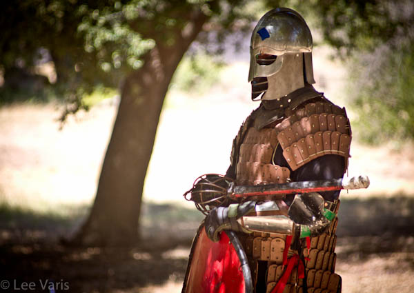
This adventure was a little shorter than usual for me so I didn’t do a lot of photography. I concentrated on capturing portraits of the participants…
Some of the most colorful characters are the “heavies” fighters. These men (and women) done full armor and participate in very intense mock battles using foam padded rattan swords, lances, battle axes and other safety weapons in what amounts to full-contact fighting! I shot the following short video clip to give you a feel for the level of intensity experienced by the brave SCA fighters:
The action is staged under the oak trees to provide some relief from the heat – one can get quite warm fighting in heaving armor under the hot sun. Participants stage a number of different scenarios which are timed and monitored by field marshals to help prevent injuries. The action is quit entertaining but often very difficult to photograph adequately. I found more opportunities in the sidelines where tired warriors rested between sets of action…
Not all of the participants at the event are fighters. Many people pursue gentler activities and you can find all manor of period arts on display including the honored discipline of the minstrel…
On my last day, while walking back to my Technopod I saw the most amazing cloud formations just beyond the ridge that separates the park from the border of Mexico. I captured several images and assembled a panorama in Photoshop. The RAW image as captured didn’t quite match the feeling of being there…
A little post processing using the techniques of my 10-Channel Workflow yielded an image that is much closer to what I felt at the scene. Click on the image to see a larger version.
Let me know if you’d like to see a tutorial where I show how I accomplished the enhancement step-by-step with screenshots, etc… Leave your comments below!




I’m always up for one of your tutorials! I have enjoyed following your work since I first discovered your tuts on linda.com.
On a different note – Have you thought of trying to use one of Paul C. Buff’s very portable “Vagabond” rechargeable units with solar panels. Supposedly, strong enough to power his line of strobes and I’d expect strong enough to power your computer/printer etc. (But I’d check with him first)
I share John’s fondness for your tutorials, but I feel you’ve gone too far on this panorama. The “cerule” looks good, but the clouds seem either too pink or not orange enough (depending on what time of day you want to represent). The ground/foliage is improved over the original, but it has way too much HDR overload look. I’d love to see how you got to this point and to see if other levels of layer opacity might achieve a less overdone look.
I have been working my way through your other tutorials and am slowly improving my retouching skills. Thanks very much for your contributions to my learning.
Yes, you are certainly welcome to have a different opinion about the color and certainly, in the process of getting to this point in the image the color “layer” could simply be backed off or the cloud color changed — this is how I “felt” the scene and I feel like I am under no obligation to make it look “natural”, whatever that means. Yes, perhaps the HDR “look” is not to your taste but simply imagine how you can easily blend the two versions, before and after, together to subdue the effect to you liking. In fact, if you like, right-click on the images to download the larger versions and layer the original onto the revised version, adjust the opacity and email the result to me — I’ll post all such efforts for comparison!
The point is that you often don’t know how far to go with an image until you go too far – then you can always back up just a little!
Actually – you have to click on the images first to load the larger version then right-click to save!