Knowing how to manipulate channels can help you with detail and saturation more than your choice of colorspace
So… I know I’ve horrified some readers with my choice of colorspace for my images. We’ve heard all of the admonishments from the “experts” and they have made a compelling argument for wide gamut colorspaces for photography. I am not interested in “arguments” only results and, in my testing, the results when using wide gamut colorspaces are unconvincing and ultimately problematic. So… I stick to what I can see on the monitor. Rather than chase down the ultimate wide gamut monitor ( and spend a boatload of money) I settle for your average “decent” monitor and profile it religiously. The files I generate travel well and are very adaptable to various displays, the web, and any printer output you can image.
OK, so your next question is 16 or 8 bits? My disdain for the experts advice carries over to this topic as well. I used to believe that 16 bits made a difference – I wanted to believe it… it makes logical sense… 256 levels just doesn’t seem like enough! However, after blind testing it on some of my more extremely corrected images, I found that editing in 16 bits offers no advantage and simply wastes hard drive space and slows down processing. I believe that true high bit depth masks would make a difference but, at the moment, the way Adobe implements high bit depth in Photoshop the alpha channels take up 16 bit space but are only calculated at 8 bit precision (all the weight but none of the real granularity) 16 bits does not seem to affect the appearance of “bands” in gradients just the position of the bands – you still need to apply various corrective measures like adding noise (or the “Spatter” filter.)
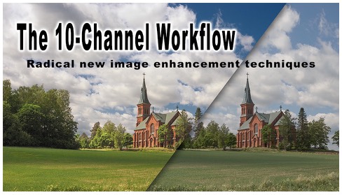
Working in wide gamut color and high bit depth may make you “feel” more professional but it doesn’t guarantee professional results. A deep understanding of channel structure in imaging will go a lot farther to improving the quality of your imaging efforts and the result WILL be more professional. A lot of the supposed benefits of high bit depth or wide color gamut editing can be understood as a by-product of smoother (grayer) channels and taking advantage of different colorspaces (like Lab) can give you even more control without requiring guesswork or extra storage space. A lot of what I will be covering in future tutorials addresses this topic directly – something I’m calling the “10 Channel Workflow.” stay tuned for future developments.
