So… a few readers cornered me to ask – “Just what colorspace do you use as your Photoshop default?”
Ok… so I kind of dodged that question in my last post. So… here it is… drum roll please…
sRGB
Thats right, satanic RGB, stupid RGB, or standard RGB, your friend and mine, the one we’ve learned to hate, good old sRGB! Why? Mostly because I gave up wanting to compromise on quality and I decided I don’t care what all the other experts say! There is no reason to use the politically correct colorspace of Adobe RGB and I don’t need to show what a big dick I have by using ProPhoto RGB. What really matters is getting good color in your pictures and for that sRGB is ideal.
sRGB is the lowest common denominator RGB colorspace but for real world images its plenty colorful. Just about all monitors can show you an accurate representation of sRGB colorspace (assuming they have been calibrated and profiled.) This means that I can be very sure that what I see on the monitor is the color I’m dealing with in the file – no surprises.
But what about all those colors that are outside the gamut of sRGB? Well, there are some real world colors that exist outside of what a typical monitor can show but even so called Adobe RGB monitors only show you 98% of Adobe RGB and I find that the problem with these ultra-colorful displays is that almost anything looks good on the monitor – then when you go to print – oops, suddenly it doesn’t look so hot. Whenever your color managed application have to do gamut re-mapping there are some compromises and things WILL shift, sometimes in unpredictable ways. This is usually not such a big issue for a more gamut constrained colorspace like sRGB. Though sRGB is still quite a bit more colorful than CMYK for most normal colors its a lot closer in gamut than Adobe RGB and as a result conversions to CMYK are easier with fewer surprises. ProPhoto is a special case scenario – this colorspace is so large that a good deal of data points are wasted on colors that are outside human vision – a much smaller portion of the space actually contains “natural” colors. Because of this, it is always suggested that you use a high bit-depth (16 instead of 8 in Photoshop) so you actually have enough points to make things like smooth gradients in you images. It all ends up being so much extra calculation for no real return on the investment. If you don’t believe me test it yourself, Take a colorful RAW file and output it to sRGB, Adobe RGB and ProPhoto RGB and print each to an Epson printer using the same paper for each. They will all end up looking the same! The only likely difference is that the sRGB image on screen will look a little bit more like the final print!
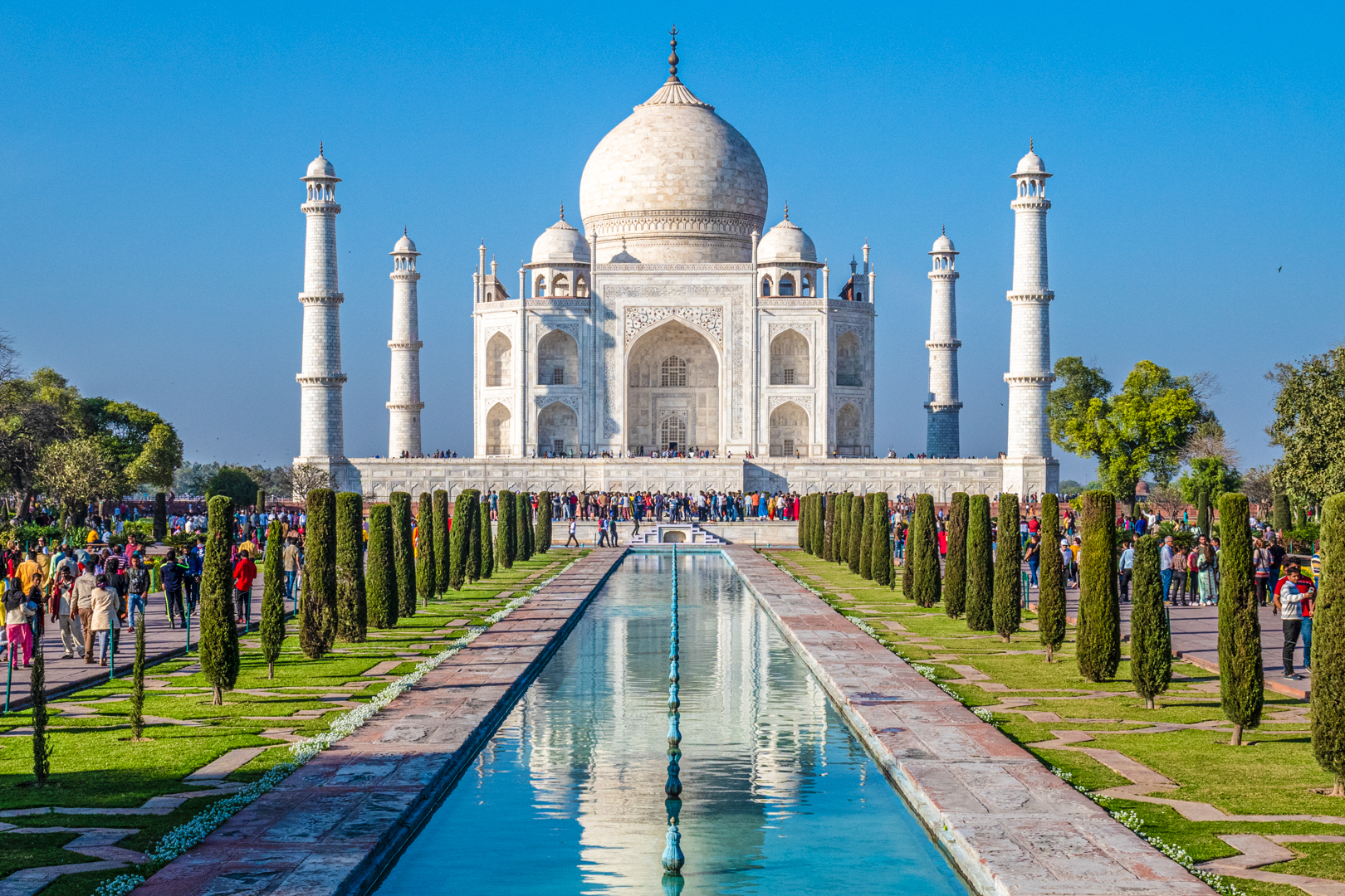
All the arguments about missing colors and potential colors, blah, blah, blah… are just distractions from what really matters. In the end, if it is a good image it will look good in Adobe RGB or ProPhoto RGB if it looks good in sRGB. Its not like, if you make a great looking image in sRGB it will suddenly look less colorful in Adobe RGB. Besides, the lights and darks in your image are vastly more important than the color gamut. Look at the image at the top – I wouldn’t want it to be any more colorful or it would look like a cartoon!
Well… I’m getting ready to leave for FOTOfusion in about 12 hours and there’s packing to be done. I’ll have more to say about this in the next blog post so stay tuned!
