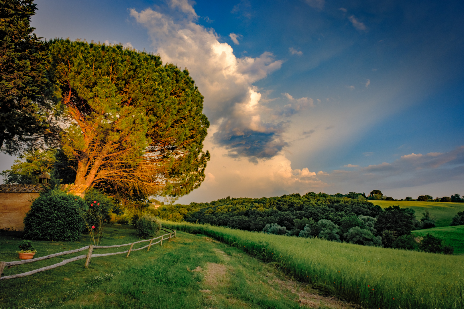
Which Photo is More Interesting (not a trick question)?

Color without tone
Or…

Only tone and contrast without any color
OK… so this is an easy one! The B+W image is way more interesting because we can actually tell what it is a picture of… Somehow, though, you’d think that the digital image industry doesn’t agree with this assessment because of all the emphasis they place on colorspaces , color gamut, ProPhotoRGB/EktaspaceRGB/BestPhotoRGB, etc… People ask me what color workspace they should use in Photoshop all the time. Mostly, photographers should be much more concerned with the lights and darks in their images – photography is, after all, the art of recording light!
Lets examine this issue a bit…
The human eye is a complex organ and there is no surprise that cameras are designed to mimic its features. The eye functions by collecting light through a lens onto a sensitive surface (the retina) the photons striking this surface are converted into electrical impulses that are interpreted by the brain to form the images that we experience. Modern cameras have a similar functionality – they collect light through a lens onto a light sensitive surface in the form of a CCD or CMOS chip. The photons striking the chip generate electrical signals which are interpreted by a computer to generate bit map images.
The retina is composed of two types of light sensitive structures known as rods and cones. Cones come in three different versions that are sensitive to narrow frequencies of light representing red, green and blue color. Rods are only sensitive to brightness and cannot distinguish color – they are, however much more plentiful and more densely packed in the retina than cones except in the very center of the retina at the fovea. Rods are also smaller and thus capable of reading more detail in the variation of light and dark. Rods are much more sensitive to light and respond in much dimmer light than cones do – one reason that color is less noticeable as the light level gets darker. The human visual system places more importance on being able to see details in dark areas that do not rely on color differences – an evolutionary advantage – obviously a good idea to be able to see that saber tooth tiger hiding in the bushes with his camouflage coloring!
The modern digital camera is actually only sensitive to brightness – color is interpreted in a post capture processing phase by comparing the different brightnesses under tiny red, green and blue filters on the surface of the camera sensor. These different brightness levels also contribute to the image details in the form of shadows and highlights. Without these shadows and highlights a recognizable image would not exist – we would only perceive abstract blobs of color (the first image above). Think for a moment how effective black & while photographs are – the value structure of an image is much more important than how colorful it is!
In fact, most people will tolerate a variety of color renderings if the contrast and tonal range is compelling. For most photographic images, insuring that the image contains a full range of tones from black to white and that the areas of primary importance contain the most contrast (or differences between tones) is much more important than how saturated or dull the colors are.

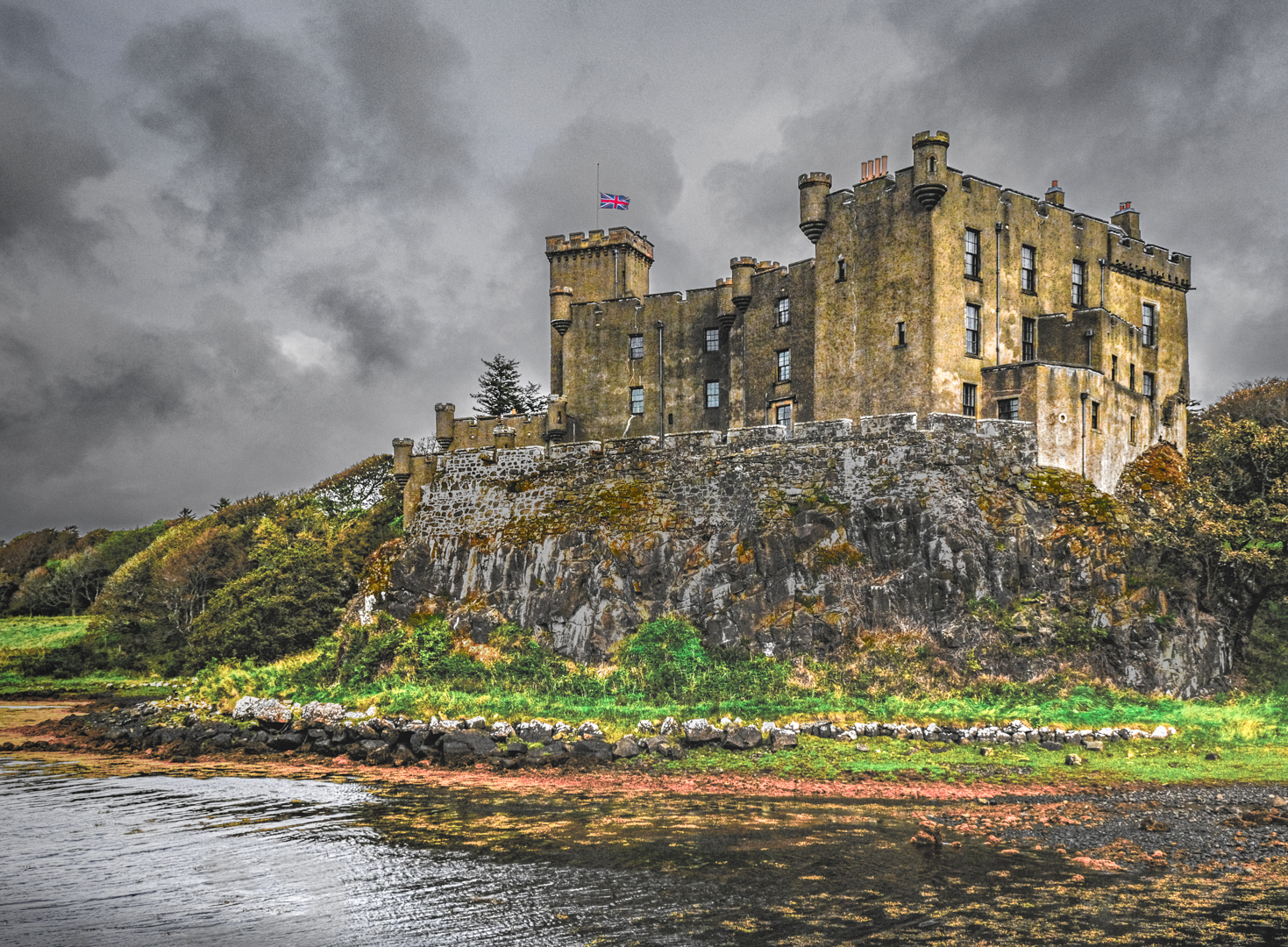
Color and tone together make a real color photograph
Is the picture above better or worse than the one below?

Is more color better color?
Color is often a very personal preference – some may prefer more, some less, some like it more blue, some think only warm color is good but mostly people actually don’t consciously think about color unless they are trained to… This is not to say that color doesn’t have a profound subconscious effect – it can clearly effect the mood of a picture. But is it the most important thing in a photograph? I think not…
So, if you want to create visually interesting photographs, concentrate on tone and contrast before you mess with the color. Mastering tone and contrast is the foundation of the new digital Zone System based on the original system developed by Ansel Adams. You can find a very detailed PDF tutorial on calibrating for a Zone System approach to your photography on my PDF page.